Creating a website that looks great and feels easy to navigate is a game changer. A user-friendly design isn’t just about aesthetics—it’s about guiding visitors to where they need to go without breaking a sweat. When a website feels intuitive, users have a better experience and are inclined to stick around.
What if the secret to keeping visitors on your website longer had nothing to do with fancy graphics—but everything to do with layout and design?
A Beginner’s Guide To Website Layouts
- A user-friendly website design enhances user experience and keeps visitors engaged.
- Website layout strongly influences first impressions and determines whether users stay or leave.
- Intuitive navigation helps users move through the site easily without confusion.
- Clear structure, logical grouping, and simple labeling are essential for smooth browsing.
- Visual balance and spacing prevent clutter and help guide users’ attention naturally.
- Strong visual hierarchy directs users to the most important information first.
- Consistency in fonts, colors, and button styles unifies the site and reinforces branding.
- Timeless design principles like the golden ratio and rule of thirds make layouts visually pleasing.
- Choosing the right layout style (grid, single-page, magazine, etc.) depends on content and purpose.
- Beginner-friendly tools like Canva, Adobe XD, and Figma help bring layout ideas to life.
- Good design includes mobile responsiveness and accessibility for all users.
- Testing, user feedback, and continuous improvement keep the site effective and user focused.
Website layouts directly affect user experience. A confusing layout can turn visitors away in seconds, while a thoughtfully organized one makes exploring content enjoyable. Think of it like walking into a well-organized store versus a cluttered one. In the online world, that initial impression is everything.
Several key elements make up a solid website layout. Navigation is pivotal—users should always know where they are and how to get to their next destination easily. The structure needs to make sense; this means logical groupings, clear labels, and not overwhelming the user with options. Visual balance ties it all together, ensuring that elements are spaced well and don’t compete for attention. Keeping it simple helps the user’s eyes navigate naturally from one section to the next.
Essential Design Principles to Master
Design isn’t just about looking pretty—it’s about working well and delivering a message clearly. Aesthetics play a role in grabbing attention, but functionality keeps users engaged. Harmonizing these aspects leads to a more compelling user journey.
Understanding visual hierarchy is crucial. It dictates what the viewer sees first and helps prioritize information. By controlling elements like size, color, and placement, you can subtly guide users through your content, directing focus where it’s needed most.
Consistency is the glue that binds a site together. When every page feels like part of the same story, users can transition smoothly from one section to another without any jarring shifts. This includes maintaining uniform styles for buttons, fonts, and colors throughout.
Time to talk proportions with the golden ratio and rule of thirds. These principles have been used by artists and designers for ages to create a natural flow in layouts. They help in placing elements in ways that feel instinctively pleasing to the eye, enhancing overall aesthetics without effort.
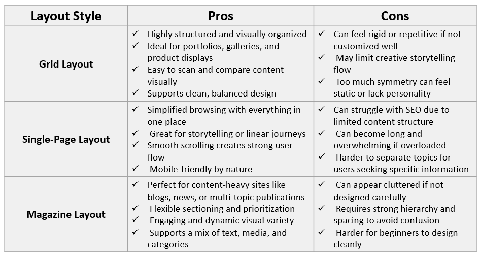
Exploring Different Website Layout Styles
Website layout styles offer a playground of possibilities to express your site’s identity while ensuring it’s functional. Popular styles like grid, single page, and magazine each serve unique purposes and can drastically change the user’s experience.
- Grid layouts offer structure and order, great for showcasing products or a portfolio where visual content needs to shine equally.
- Single-page layouts are perfect for sites with a singular narrative or a linear flow, making scrolling a seamless experience.
- Magazine layouts are another beast altogether—ideal for content-heavy sites like blogs or news, where variety in content type and prioritization are key.
Each layout style has its own set of pros and cons. Grid layouts, while visually appealing, can sometimes feel rigid and less flexible. Single-page designs simplify navigation but may struggle with SEO challenges due to condensed content.
Choosing the right layout style depends on your content and goals.
Want heavy visual content? Grid might be your best bet.
Need to tell a story or present info consecutively? Single-page design works wonders.
If it’s a mix of topics and media: Magazine styles will shine.
Design Tools and Software for Beginners
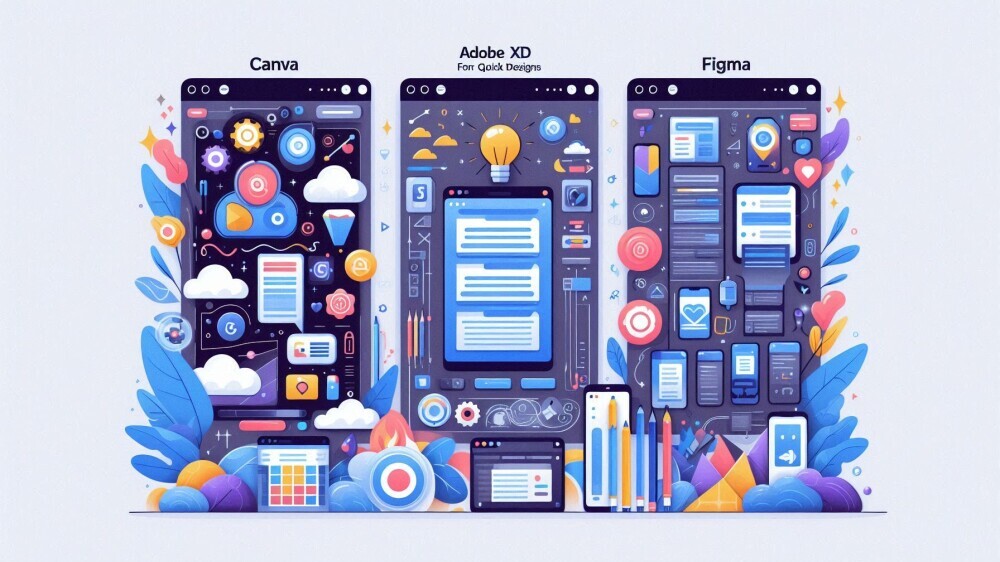
Starting out in web design without the right tools is like trying to paint without brushes. Luckily, there’s a bunch of beginner-friendly software out there to help you bring your layout ideas to life.
Imagine trying to design your website on paper and then someone hands you Canva or Adobe XD. These tools offer a seamless way to create and tweak layouts digitally.
- Canva is super intuitive for quick designs
- Adobe XD provides more depth for prototyping and tweaking.
- Figma is another solid choice, especially if you’re working collaboratively. Its cloud-based platform makes it easy to design alongside teammates, in real-time or at your own pace.
When choosing design software, consider what you need. Are you just mapping out ideas, or are you diving into detailed prototypes?
For quick layouts: Canva could be perfect.
Robust design and prototyping in one: Adobe XD or Figma is the way to go.
Each tool has its quirks and benefits, so it might be worth experimenting with free versions first. This way, you can see which matches your workflow without committing upfront. With practice and the right tools, your designs will only get better!
Practical Tips and Best Practices for Designing Your First Website
Jumping into designing your first website can feel intimidating, but breaking it down into steps can make it manageable.
Start with planning your layout through wireframing. Sketching your ideas helps map out how users will interact with your site and ensures a smooth flow of information.
Prototyping is the next step, taking your wireframes and adding detail with the design tools. This is where color, typography, and style come into play, bringing your vision to life.
Don’t forget about mobile optimization. With so many users accessing sites from their phones, ensuring your design is just as effective on small screens is essential. This might involve tweaking layouts or simplifying navigation to maintain a great experience across devices.
Considering accessibility isn’t just good practice—it’s crucial. Make sure your site is usable for everyone, including those with disabilities. This includes aspects like text readability, color contrast, and keyboard navigability.
Keep testing and iterating. User feedback is invaluable and can guide improvements. Watch how real users interact with your design and make tweaks as necessary. The more adaptable you are to feedback, the stronger your website will become.
Conclusion
Designing a website layout isn’t just about making something that looks polished—it’s about crafting a smooth and enjoyable experience that keeps users engaged. When structure, visual hierarchy, consistency, and functionality come together, your website becomes more than a collection of pages: it becomes a guided journey that feels effortless. With thoughtful planning, smart layout choices, and the right tools, anyone can build a website that is visually appealing, easy to navigate, and built for real results. Step by step, testing and refining, you’ll watch your design evolve into something users will love exploring.
Which website layout style do you prefer—grid, single-page, or magazine—and why?
Share your thoughts below! I’d love to hear what works best for you and your projects.