

Adaptive images on the web are all about delivering the right image at the right size for every device. This makes sites look better, load faster, and work smoothly whether you’re browsing on a small phone or a big desktop screen. The main idea is simple: images adjust automatically so users aren’t downloading massive files when they don’t need to. When you optimize images for different devices, everyone finds your site way more enjoyable to use.
Ever loaded a beautiful photo on your phone, only to find it takes forever to appear?
Quick List: Adaptive Image Fundamentals
- Responsive images fit the screen size and resolution
- Picture and srcset elements help browsers choose the best image
- Image optimization keeps page loads speedy
- Modern formats like WebP can give a boost to performance
- Tools and plugins make this process easy
- Good adaptive images help SEO and accessibility
Why Adaptive Images Matter
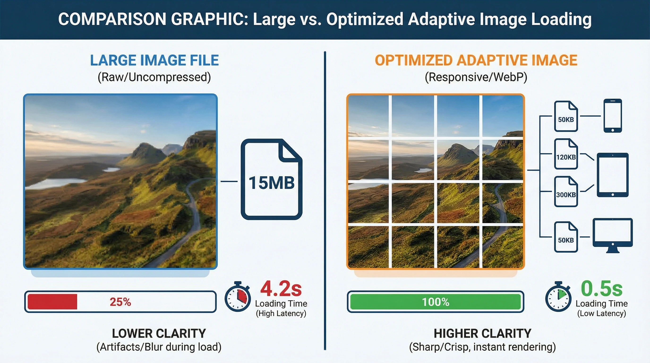
Adaptive images are super important for web performance and user experience. Big, unoptimized images slow down websites, waste data, and might even drive visitors away, especially on mobile. When a site uses adaptive images, visitors spend less time waiting and more time actually enjoying the content. Plus, smaller images mean less bandwidth used, which is great for people with limited data or slow connections.
Google cares about page speed, so sized-right images can help your site climb in search results. Adaptive images make your content look sharp and next-level cool, no matter where people access it. Keeping files trimmed down not only helps with speed, but it also brings a more professional look to your site.
Images that load smoothly also help with accessibility. Folks on older devices or those with data limits can browse without struggling with blurry or oversized pictures. So, whether your users are on a speedy desktop or a slow phone, adaptive images offer a smoother, more reliable browsing adventure for everyone.
How Adaptive Images Work
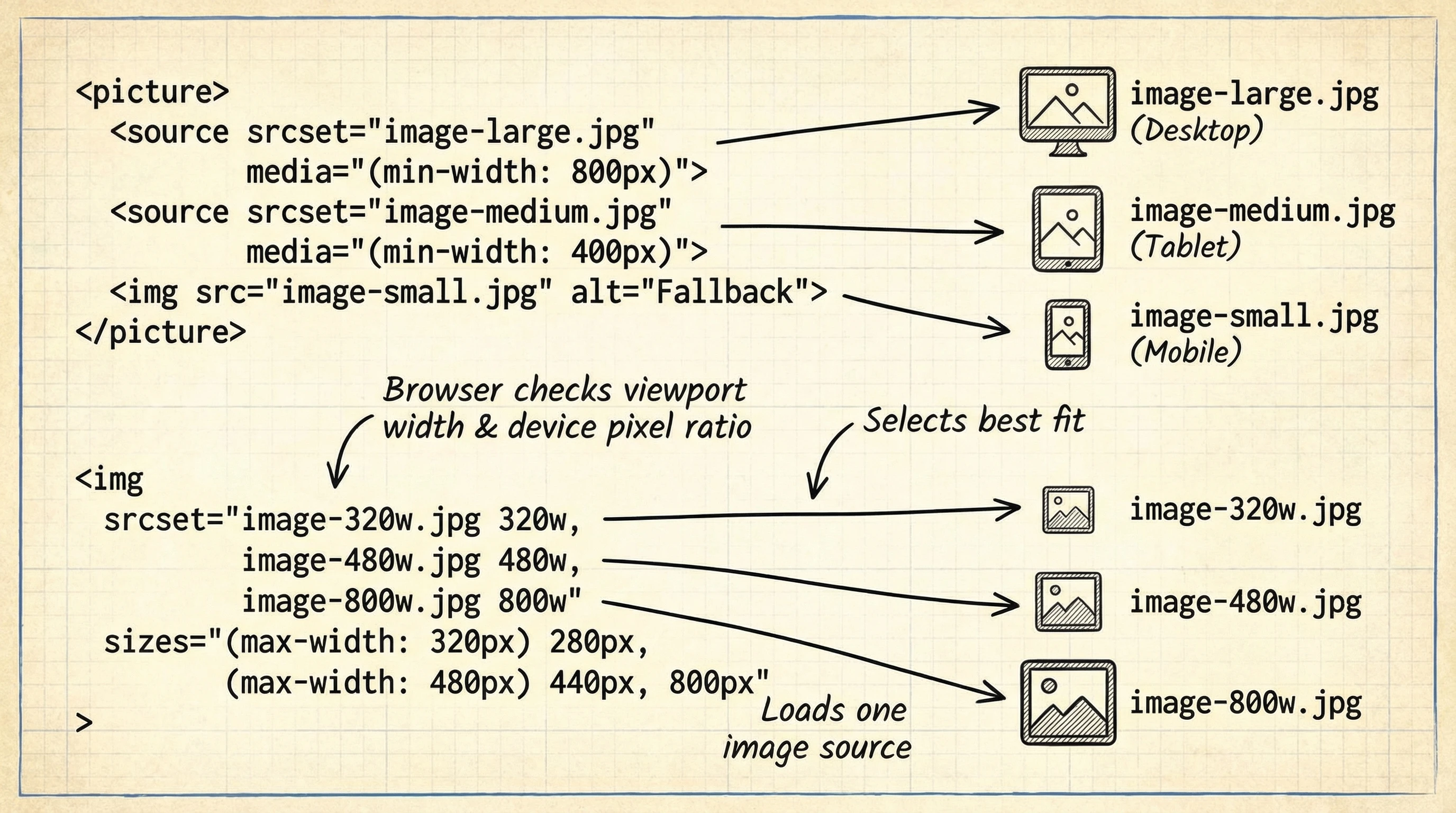
Adaptive images usually blend HTML techniques with smart image processing. The two primary tools are the srcset attribute and the
Here’s a quick look at the basics:
- Srcset lets you show different image files and their sizes
- Sizes describe how wide each image should appear
- Picture allows browsers more options, like displaying WebP for those who support it or JPEG as a backup
The browser picks the smallest file that still looks good for each device, saving bandwidth and keeping images nice and crisp. No more worrying about massive images slowing things down or tiny images looking blurry. It’s a win-win for performance and appearance.
Optimizing Images for Performance
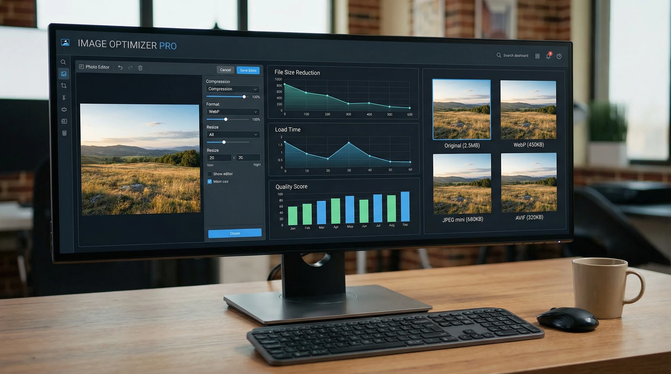
Getting adaptive images right takes more than just tossing in a couple HTML tags. Image optimization can make a huge impact. I recommend a few essential steps for any web image:
- Resize images so you don’t upload files larger than necessary
- Compress files to shrink size while maintaining quality—tools like TinyPNG or Squoosh work wonders
- Use modern formats like WebP or AVIF when possible to maximize quality with lower file sizes
- Scan your site with tools like Google PageSpeed Insights to track down any problem images
For big or busy sites, image plugins (like ShortPixel or Smush) can automatically handle all these steps while you upload files. Letting automation handle optimization saves time and keeps your site consistently speedy.
Common Pitfalls and Easy Fixes
I’ve come across a few snags when setting up adaptive images. Here are some common glitches and what you can do to fix them:
- Uploading one giant image and expecting it to look good everywhere. This can leave your site crawling and frustrate users.
- Using modern formats (like WebP) with no backups, causing some browsers to display nothing at all
- Skipping width and height attributes, which might unexpectedly throw off your layout
Luckily, these problems are easy to fix. Double-check your code, toss in fallback images for browser compatibility, and test your site on various devices and browsers before launching. Your users—and Google—will appreciate it. Smooth images keep your site looking sharp and responsive.
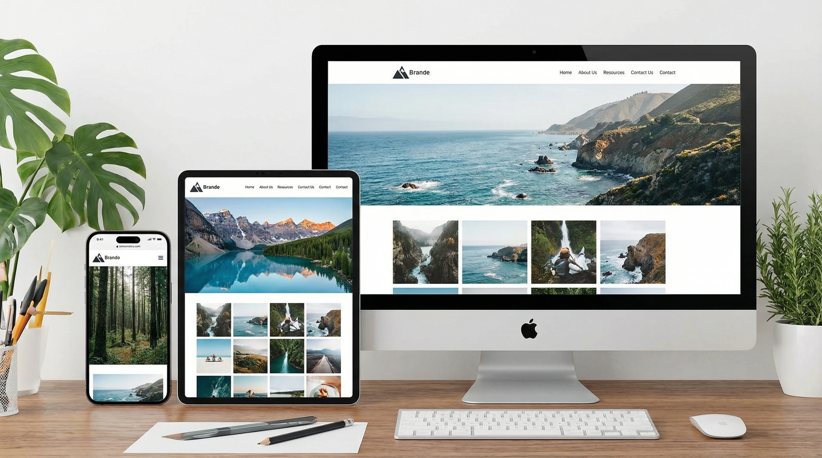
Adaptive Images in Action
Adaptive images have basically become the standard for modern websites. If you use platforms like WordPress, Wix, or Squarespace, you probably already get some adaptive features automatically. For those building sites from scratch, using picture and srcset allows for more control and creativity; you can even swap out images for different crops or art direction between mobile and desktop.
Using adaptive image techniques keeps your website fast, userfriendly, and current with trending SEO strategies. Whether you’re working on a personal blog or building a flashy portfolio, spending a little time with your images gives a big upgrade to your website’s performance and appearance.
How Do You Handle Web Images?
Have you tried using adaptive images on your site?
Share your favorite tools or tricks below, and help others build better, faster websites!