

The world of web design moves fast, and keeping up means making sure websites work on any device. Responsive design frameworks handle a lot of the heavy lifting. These toolkits help me build sites that look fresh and function well, whether someone’s on a phone, tablet, or massive desktop screen. I’m always impressed with how much time they save and the solid results they deliver for users.
Ever scrolled a site on your phone and wished the buttons didn’t overlap? That’s why responsive frameworks are so important.
Top Takeaways
- Responsive frameworks save development time with prebuilt grids and components
- CSS and JavaScript features help adapt layouts to any screen size
- Popular frameworks include Bootstrap, Foundation, Bulma, Tailwind, and Materialize
- Customizing frameworks lets you match your site’s unique brand
- Accessibility and performance are key parts of modern frameworks
- Choosing the right framework depends on your project’s goals and style
Understanding Responsive Design Frameworks

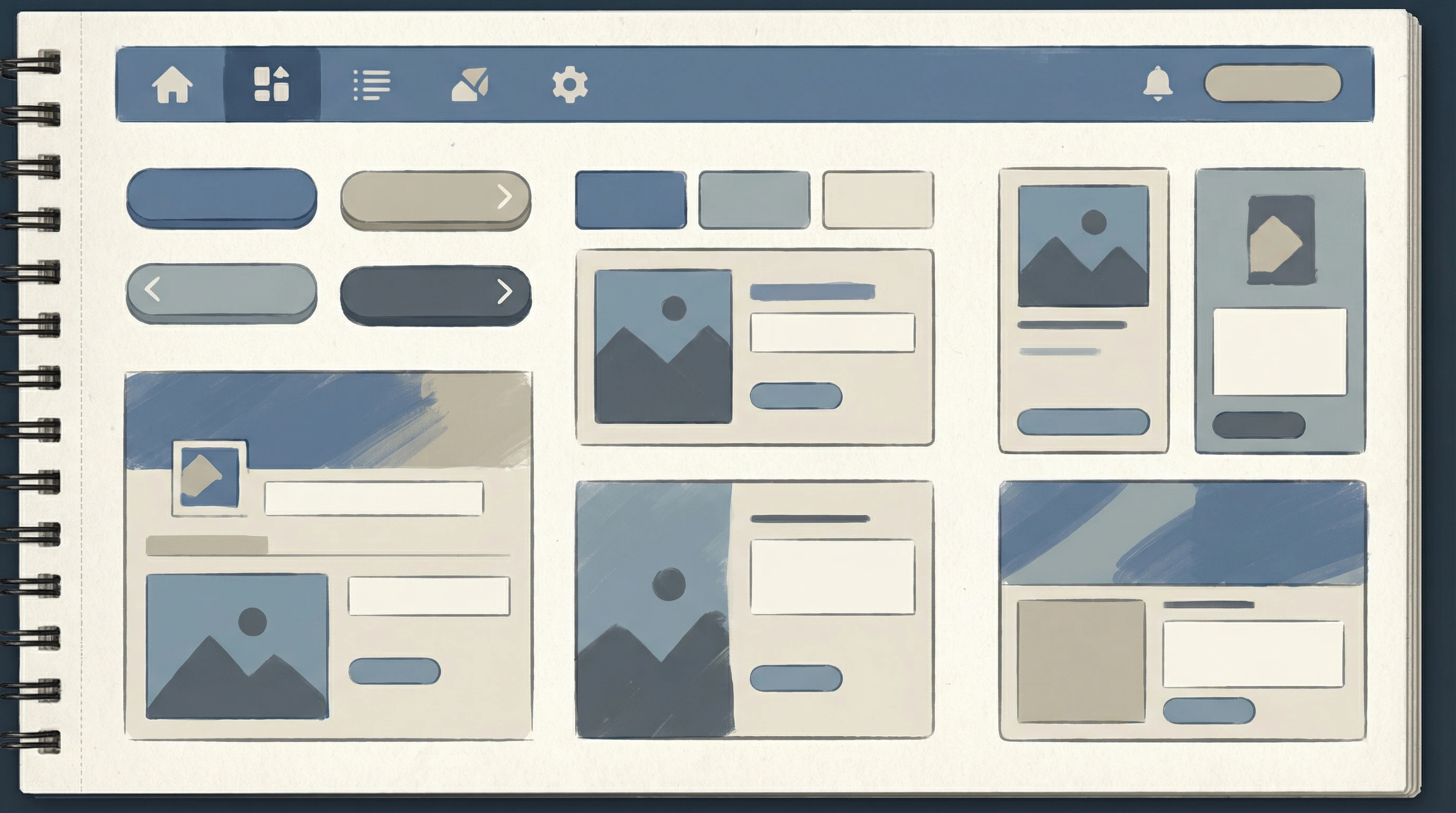
A responsive framework gives me a collection of HTML, CSS, and sometimes JavaScript tools. These tools handle mobilefirst layouts, so I’m not building from scratch every time I want a modern, flexible site. Most frameworks offer things like grid systems, navigation bars, buttons, and form controls that all respond smoothly to changes in screen size. I find this super useful for speeding up project timelines.
I like to think of these frameworks as boxes of Lego for web design. They’re reusable pieces that just fit together. Instead of worrying about breakpoints and complex flexbox hacks, I can focus on the creative side and still get professionally polished results. This approach also lets me avoid coding the same basic elements over and over, making my workflow much faster and my websites more reliable.
Beyond just saving time, using a good framework helps maintain consistency across different projects. When different developers work on the same site or when you expand your team, having a single set of building blocks keeps everyone on the same page. That’s a big deal for scaling web projects!
Most Popular Responsive Frameworks for Web Design
I’ve worked with a bunch of different frameworks, and some show up over and over for very good reasons. Here are a few I always consider:
- Bootstrap: Probably the biggest name in the game. It’s got an easy to use grid, tons of readyto go UI elements, and great docs. There’s a reason you see Bootstrap in so many projects.
- Foundation: ZURB’s Foundation feels a bit more advanced, with some extra options for customizing layouts and workflows. I like the pro feel and flexibility.
- Bulma: If you want a modern, CSSonly setup with nice builtin responsiveness, Bulma is worth checking out. The classes are simple and modular.
- Tailwind CSS: Tailwind is utilityfirst, which means you build layouts by combining lots of focused classes. It can look overwhelming at first, but the control is awesome if you want finetuned custom designs.
- Materialize: This one builds on Google’s Material Design philosophy. If you like clean, cardbased interfaces, Materialize is a smooth pick.
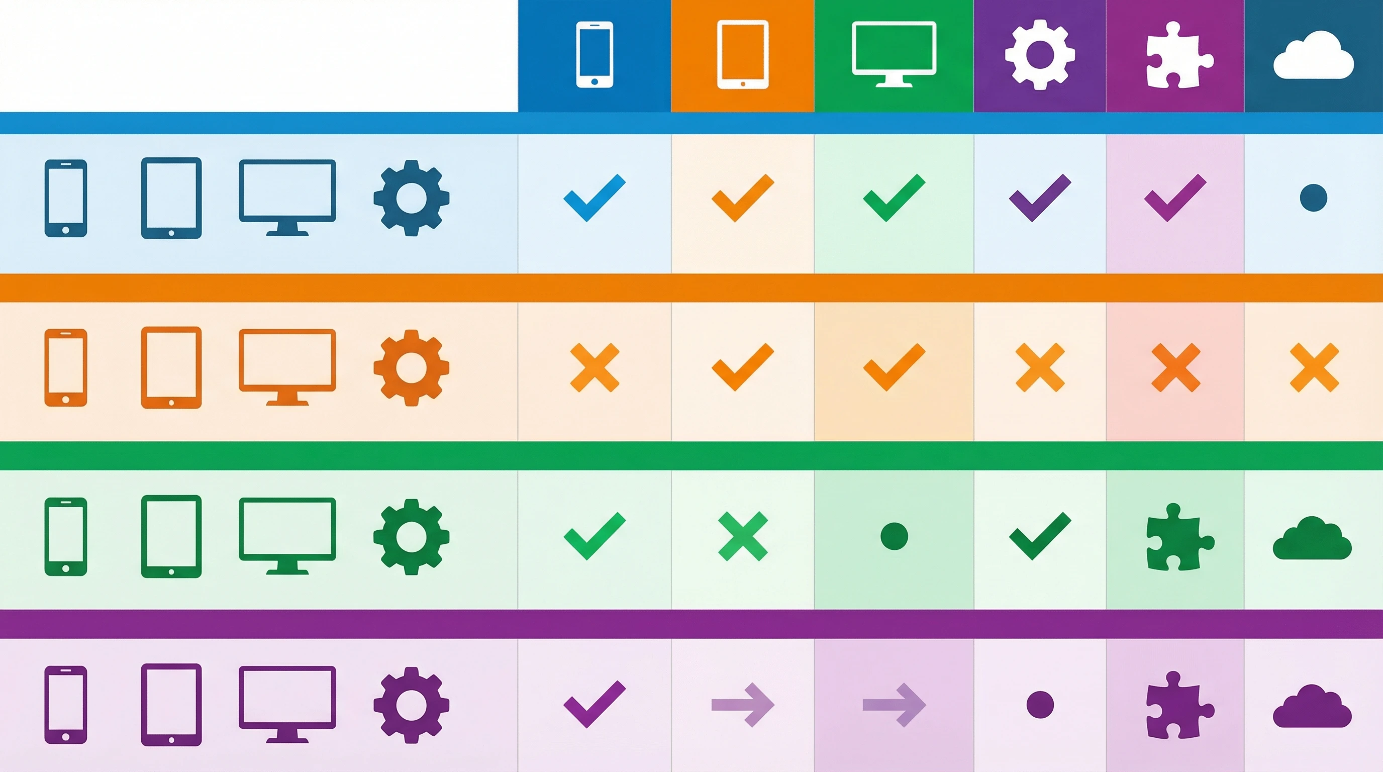
Each framework has its own strengths, so the right choice often boils down to your own needs and preferences. For example, Bootstrap and Foundation are great for rapid prototyping, while Tailwind excels if you want to break free from default styles and build something uniquely yours. Bulma and Materialize are solid picks for clean, simple foundations that you can expand or style as needed.
Cool Features That Make Frameworks Worth Considering
Responsive frameworks pack in a bunch of features that make life easier. I usually notice:
- Mobilefirst approach so layouts work well on small devices by default
- Handy grid systems for making smart, flexible columns
- Prebuilt UI components like modals, dropdowns, and navbars
- Helpers for easy customization and theming your site
- Accessibility baked in for screen readers and keyboard navigation
All these layers add up to less grunt work for me and smoother experiences for anyone visiting the site. Frameworks also tend to keep up with web standards and best practices, meaning I can rely on them for up-to-date accessibility features or performance optimizations. That’s both time-saving and reassuring—especially when sites need to support a diverse set of users and devices.
Another plus is the sheer scale of community support around these frameworks. From plugins to documentation, you rarely run into a roadblock that hasn’t already been solved by someone else. This makes troubleshooting and learning much faster.
Choosing the Right Framework for Your Project

Picking the right responsive framework depends on your workflow, skill set, and end goals. For quick landing pages, Bootstrap or Bulma is handy. If you want pixellevel creative control, Tailwind gives you that freedom. Foundation is solid for larger projects needing lots of custom work, and Materialize is nice for those looking to nail the Material Design vibe.
Testing is also a big part of my process. I like to play around with demos or starter templates to see what feels best for the kind of site I’m building. Sometimes, even checking out code snippets or previewing how forms and menus look can make a difference in your choice. A little upfront research always pays off in the long term.
Another consideration is how well a framework connects with your larger tech stack. If you’re building web apps using a JavaScript framework like React or Vue, you’ll want to check if your design framework has integrations, components, or companion libraries to save you from extra setup work.
Responsive Frameworks and the Future of Web Design
Responsive frameworks keep growing, and they’re always adding features to handle new devices, speed, and accessibility. I keep an eye out for how these tools are changing, especially with new frontend tech like React and Vue making integration even smoother. Staying curious about these changes has helped me stay ahead of trends and deliver better websites for everyone.
Looking ahead, frameworks are starting to include support for things like dark mode, advanced animations, and improved mobile performance. They’re evolving fast, so learning how to make the most of new updates is worth the effort. Whether you’re a seasoned developer or just getting started, taking time to explore features and experiment with settings is one of the best ways to keep your web skills sharp.
Your Turn
Which frameworks are your favorites, and how have they changed your workflow?
Drop your thoughts or questions in the comments. I’m always happy to swap tips or help out if you’re stuck picking a starting point for a new project.