
Typography in web design means more than just picking pretty fonts. It’s about creating a look and feel that actually helps people find their way around and enjoy a website. At the same time, it gives a brand its unique personality. The typefaces I choose, and how I use them, play a big part in how easy a site is to read, how people feel about it, and even whether they come back for more.
Ever wondered why some websites just feel easier to read and more inviting than others?
Key Points to Understand
- The basics of typography: font types, sizes, spacing, and alignment
- Why readability matters so much in web design
- How font choices influence mood and trust
- Design trends and websafe fonts
- Responsive typography for all screen sizes
- Accessibility and making sure everyone can read your site
Font Types and Hierarchy: Setting the Tone
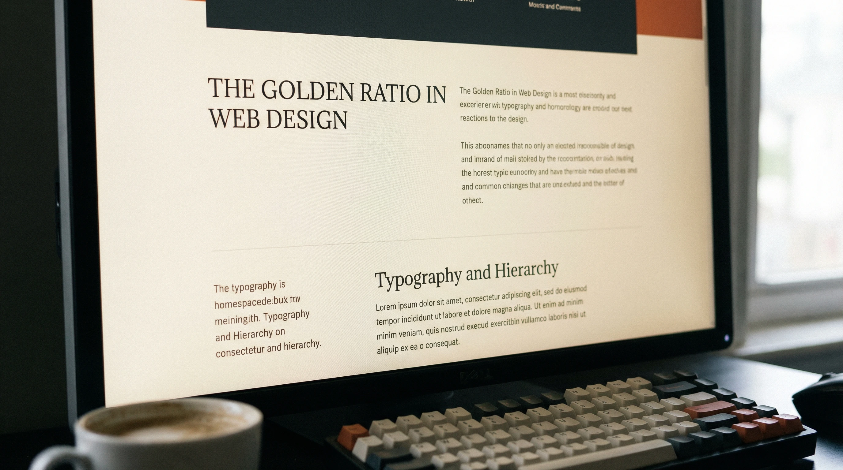
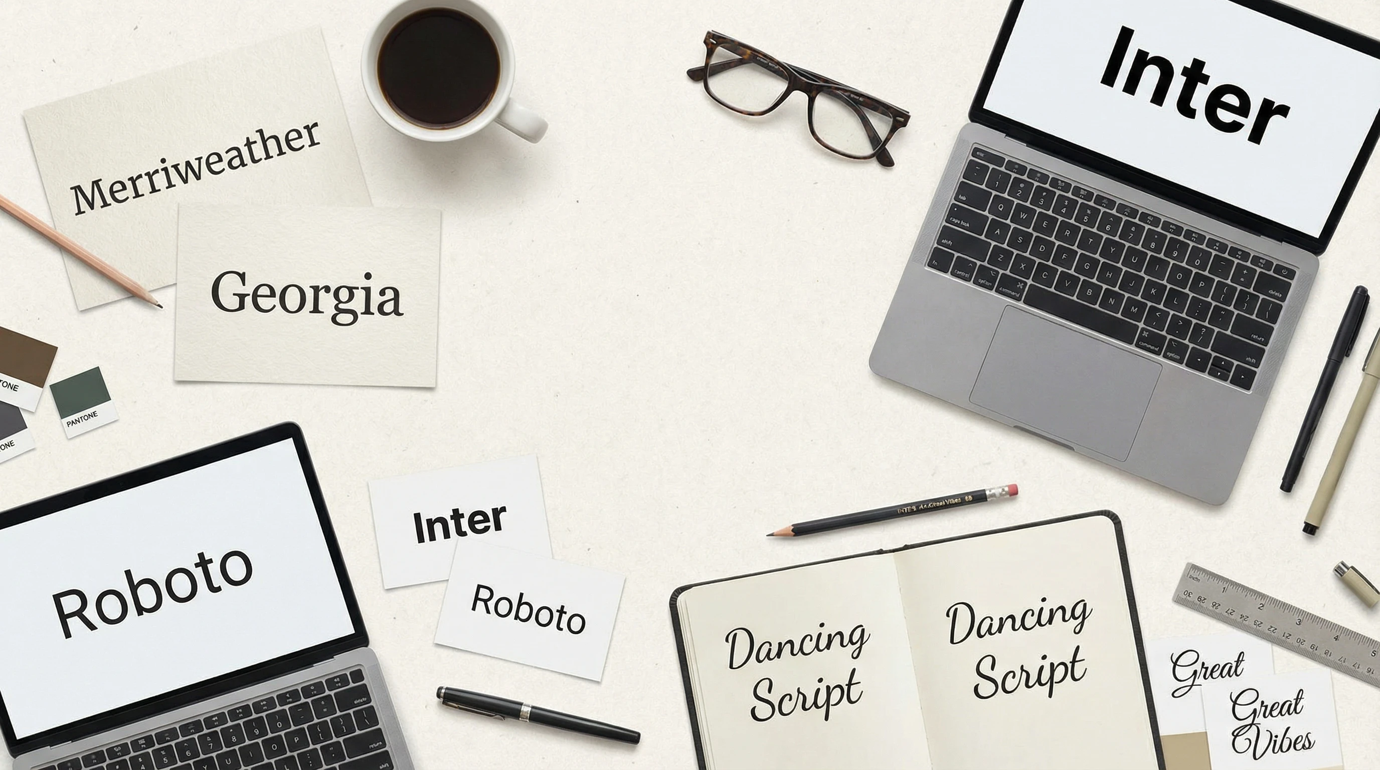
I like to start by sorting fonts into categories: serifs, sansserifs, scripts, and decorative styles. Serif fonts give a classic, trustworthy vibe; think news sites or education pages. Sansserifs deliver a cleaner, more modern feel. Script and decorative fonts look fun but are tough to read in long paragraphs. Mixing just two or three fonts creates a visual system that guides the eye. I use bigger, bolder titles for the main points and subtler text for details, building a clear hierarchy so readers know what’s important at a glance. Sometimes, even adjusting font weight or italics can help show which information matters most.
Readability: Making Text Pleasing and Easy
A site might look amazing but fall flat if the text is tough to read. I always pay attention to font size, letter spacing, and line height—little tweaks here can really boost comfort. The contrast between text and background is super important too. Dark text on light backgrounds or the other way around helps tone down eyestrain. Consistency matters a lot, so sticking to the same sizes and colors for headers or body keeps things organized. Great typography is not about flashiness; it’s about making content easy on the eyes.
Along with the visual aspects, I think about the writing style. Simple, clear language pairs well with easy-to-read fonts. If there’s too much clutter on the page or fancy typefaces everywhere, even the nicest design can feel like a chore to read. Aiming for clean, open space around paragraphs also makes text more approachable, especially on mobile devices where things can get cramped quickly.
Pros and Cons of Popular Web Typography Choices
- Serif Fonts
- Pros: Classic style, gives a boost to trust and authority
- Cons: Can look dated or less readable on lowres screens
- SansSerif Fonts
- Pros: Modern, clean, super readable on digital screens
- Cons: Sometimes seen as too informal or cold for formal sites
- Custom and Decorative Fonts
- Pros: Can create a unique, standout look
- Cons: May load slowly or not display properly on every browser
- Websafe Fonts
- Pros: Work everywhere, load quickly
- Cons: Fewer creative options, can look generic
Creating Brand and Mood with Type
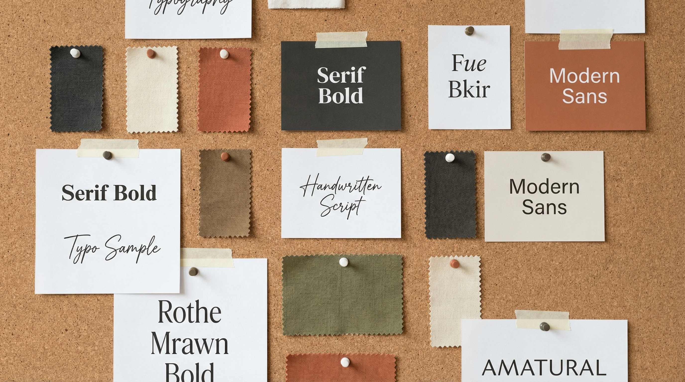
The fonts on a site send signals about the personality and vibe of a brand. Playful script styles suggest friendliness, while sleek sansserifs can feel hightech or minimalist. Whenever I design a new site, I test fonts in real headlines and paragraphs, because seeing them in action on a page makes it easier to spot if something’s off or tough to read. A brand hoping to connect with young audiences might go for bold, rounded letters, while a law firm likely sticks with reliable, timeless typefaces. Even color choices for text impact the mood—a hint of blue might feel calming while bright reds can add energy.
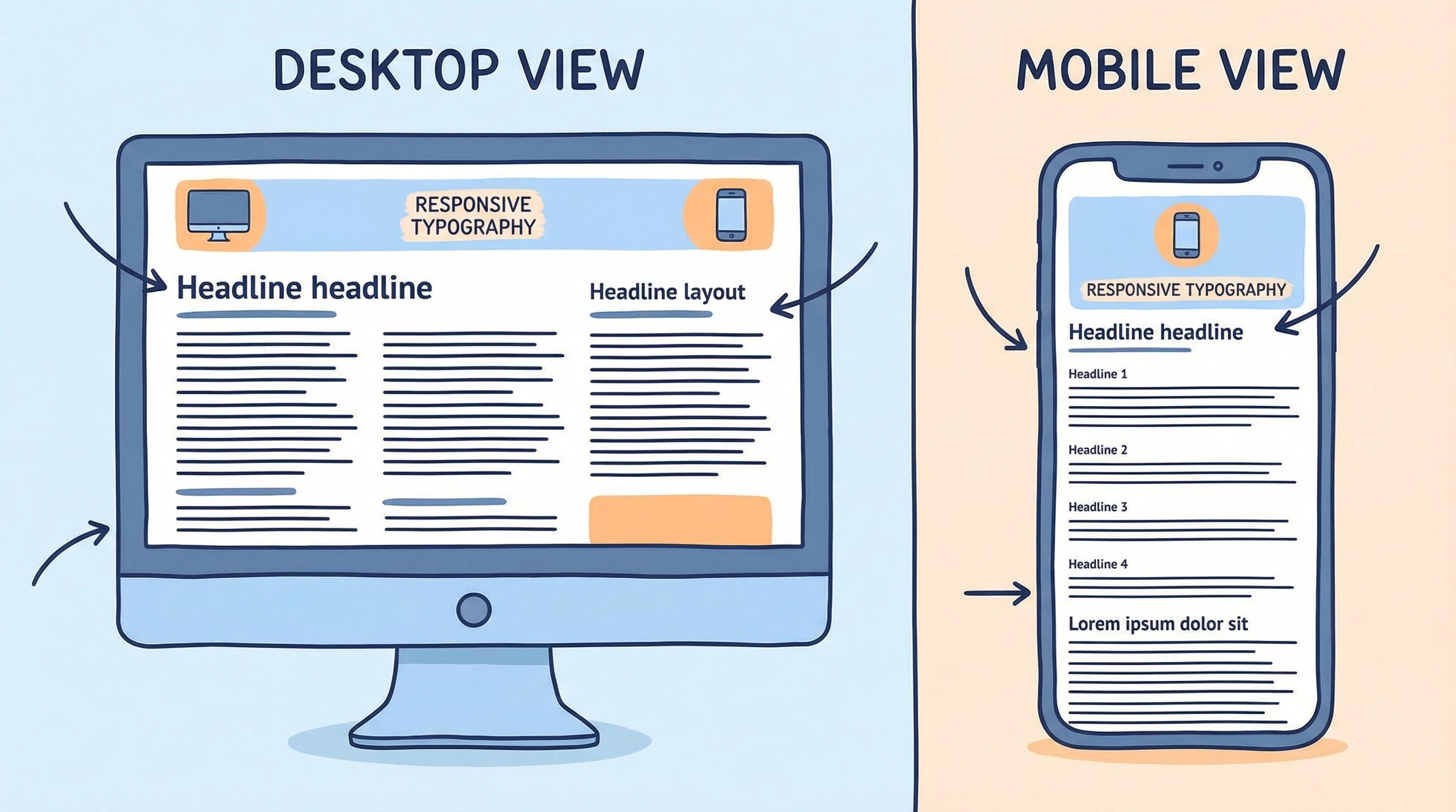
Responsive Typography: Looking Good Everywhere
With people browsing on phones, tablets, and huge monitors, typography needs to adapt. I use relative units like “em” or “rem” for font sizes, which scale better than fixed pixels. Responsive type and flexible line lengths help keep everything readable, even when the screen size changes. It’s honestly one of the most practical things you can do for a friendly user experience. For example, a headline that looks perfect on a laptop might crowd a phone screen, so I always doublecheck how text reflows on different devices. CSS media queries can help adjust fonts for each screen.
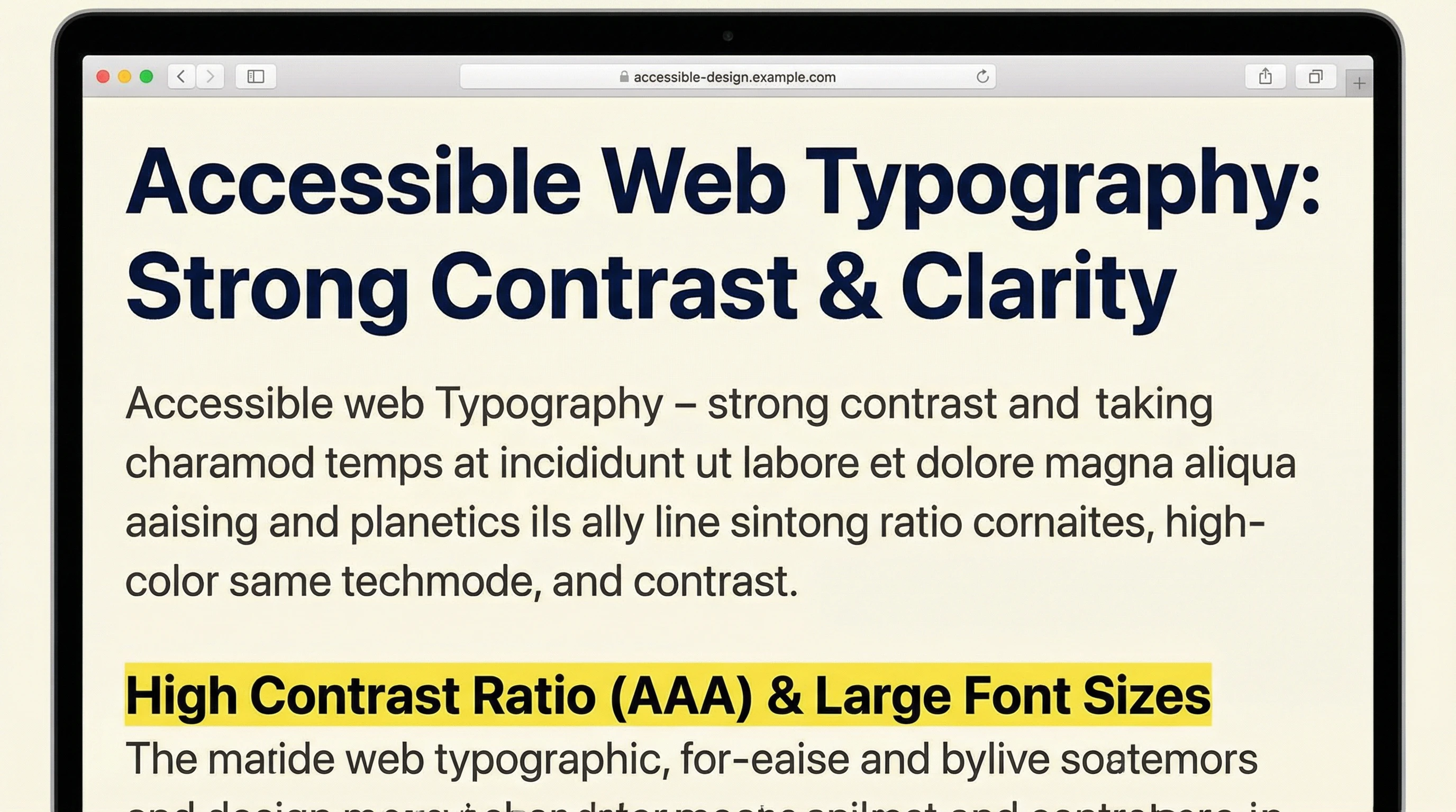
Accessibility: Opening Up Your Site to Everyone
Accessible typography means more people can comfortably use your site, including folks with visual differences. Good contrast, simple typefaces, and scalable text give everyone a better shot at enjoying what you create. Such small changes make a big difference for real users. It’s also worth adding alt text to images and letting users resize text without breaking the layout—these little details step up the experience for everyone.
Practical Takeaways
- Pair fonts for contrast but keep it simple
- Stick to clear, readable sizes—bigger is usually better online
- Always test your font choices on real devices before making a final decision
How do you decide which fonts look and work best on a website?
If you have a favorite font combo or a trick for giving a boost to readability, I’d love to hear about it! Drop your thoughts below and jump in the discussion about making typography shine online.