

Before building any website, it’s worth knowing how much things have changed over the past decade. Mobile-First web design puts smartphones and tablets at the center of the creative process, instead of treating them as an afterthought. With most people browsing on their phones, this approach isn’t just convenient. It’s really important for great user experience and better business results.
Ever pulled out your phone and left a website because it just didn’t work?
Key Takeaways
- Mobile browsing is now the norm: Over half of global web traffic comes from mobile devices.
- Google prioritizes mobile friendly sites in search rankings.
- MobileFirst design gives a boost to user experience across every device.
- Mobilefirst helps reach wider audiences, including people who rely on their phones for all their internet access.
- A mobilefirst approach usually boosts conversions and lowers bounce rates.
- Designing mobilefirst makes scaling up to desktop smoother and less stressful.
Why Mobile-First Isn’t Just A Trend Anymore
Everywhere I go, I see people shopping, reading the news, or checking their social media feeds on their phones. It makes sense; phones are always with us, always connected. According to Statista, smartphones now account for more than 50% of all global web traffic. Sites that aren’t mobilefriendly just can’t compete anymore. If your website doesn’t work well on a phone, visitors will bounce just as fast as they arrived.
Search engines like Google have noticed this popular change. Since 2018, Google’s ranking system, called mobilefirst indexing, looks at the mobile version of your website before checking the desktop one. So if your mobile site is clunky or broken, your rankings will probably take a hit. It can make a real difference in your site’s visibility.
Designing with mobile in mind from the beginning makes sure your website loads fast, looks great on any device, and is easy to use, no matter where someone visits from. This isn’t just a nice bonus. It’s super important for keeping people happy and engaged with your site. If you want your content to reach its full potential and your business to grow, you need to put mobile at the center of your strategy.
Top Benefits of Mobile-First Web Design
Checking out mobile first design for myself, I keep noticing a bunch of clear perks. Even small changes at the start of the process can set your website up for ongoing success.
- Better user experience on all devices. When sites are built first for tiny screens, everything feels simpler and more focused, making things easier for users everywhere. Minimalist layouts and easy navigation help everyone find what they need in seconds.
- Faster loading speeds. Mobilefirst sites often use less code, compressed images, and lightweight layouts. That means faster load times, which everyone appreciates. Visitors don’t have to wait around for slow graphics or scripts.
- Easier navigation. Big buttons, simple menus, and clear calls to action help people get what they need with a single tap. It’s not just about looks; it’s about making life easier for your visitors.
- Reach more users. Not everyone has access to a computer all the time, so your site becomes accessible even in places where mobile is the only option. This is especially important in countries or regions where phones are the main way people get online.
- Improved search rankings. Google and other search engines reward sites that work well on mobile, which means more traffic for your website. Taking a mobilefirst approach could boost your overall website visibility and open the door for more opportunities.
On top of all this, starting with mobile means you’re futureproofing your design. As new devices roll out, your site will already have a solid foundation for adapting to screen sizes you can’t even predict yet.
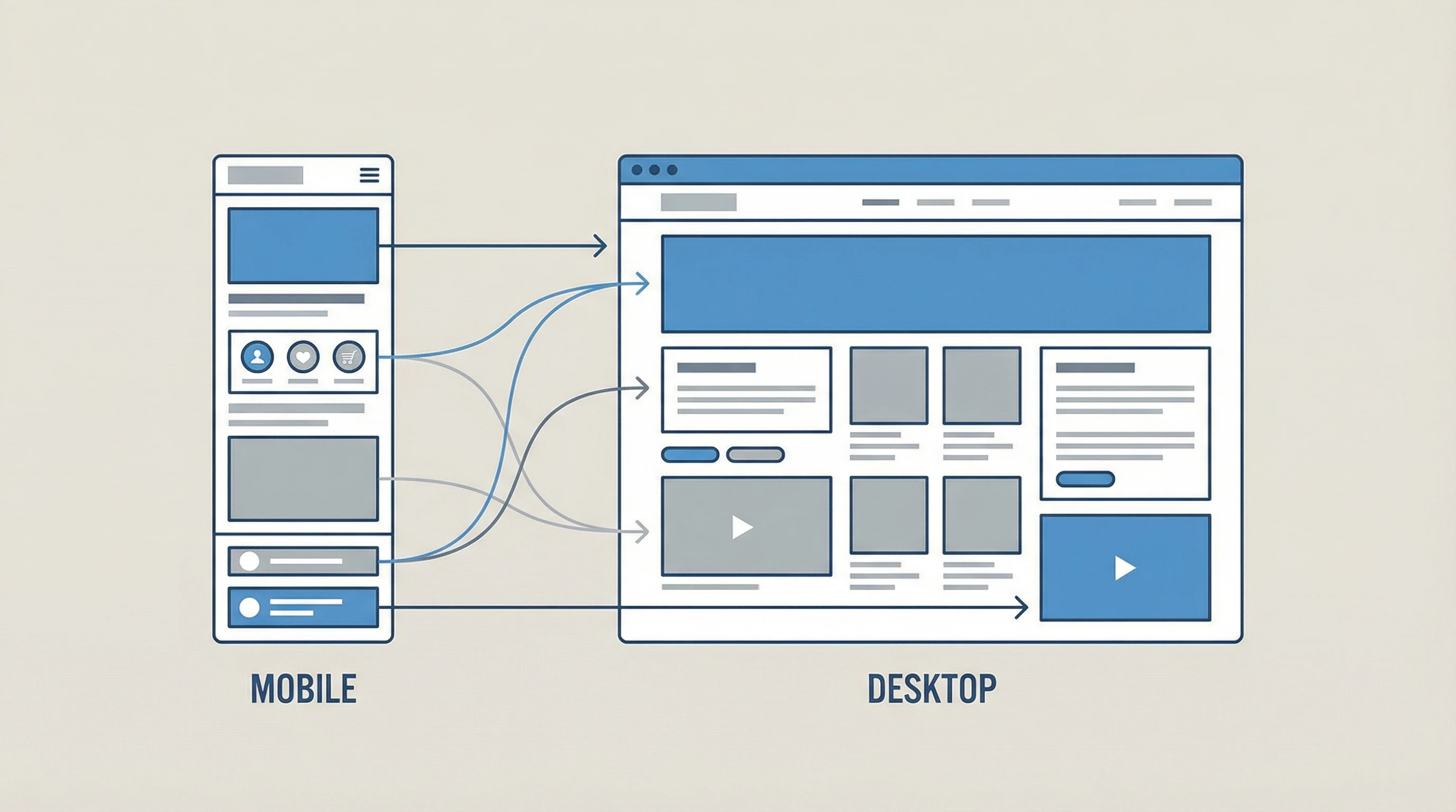
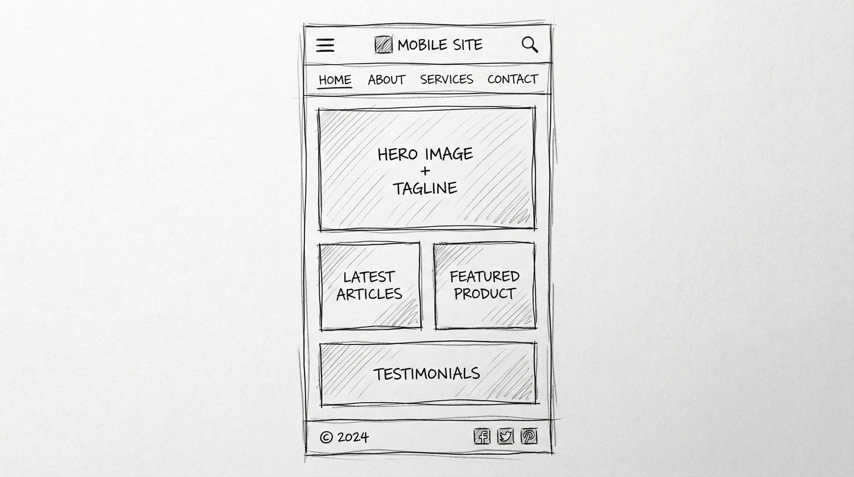
How Mobile-First Design Actually Works

The process might sound pretty technical, but it all boils down to building your site from the smallest screen up. I usually focus on basic features and clear visuals for phone screens. Then, as the design gets stretched out for tablets and desktops, I add more detail and functionality. That way, the core experience is always solid, even on a small screen.
A typical mobile first site uses responsive design. This means the website layout changes and scales based on the size of the screen. Developers write CSS code using media queries to adjust everything smoothly to different devices. Tools like Bootstrap and Tailwind CSS make it easy to get started. They offer prebuilt design components that help deliver a unified look and feel as your site grows.
It’s not just about looks. It’s also about performance. You want your site to load quickly, images to be right-sized, and forms to be super easy to fill out—even if your visitors are using just their thumbs. Taking care of these details can keep people engaged longer and make them more likely to return.
Real-World Impact: Stories and Results
Once, I helped a small coffee shop redo their website with a mobilefirst approach. Before the redesign, almost half their site visitors left right after landing, and hardly anyone ordered online. After updating to be phonefriendly—with larger menus, obvious buttons, and quicker loading—their bounce rate dropped and mobile orders shot up by more than 30% in just a few months.
The same results show up everywhere. E-commerce sites see higher sales, local businesses get more appointment bookings, and nonprofits reach more supporters. Making things easy for phone users pays off whether you’re selling products, building community, or sharing your latest blog posts. Even personal blogs benefit, helping you reach new readers no matter where they’re located or what device they use.
Tips For Getting Started With Mobile-First Design
Getting started with mobilefirst design doesn’t have to be complicated. I keep a few simple steps handy:
- Plan your content and layout for smartphones first. Focus on what matters most to your visitors and make every word count.
- Use large, readable fonts and buttons that are easy to tap. Make sure links and navigation are spaced so fingers don’t make mistakes.
- Keep images small and optimized for fast load times, especially for users with limited data connections.
- Test on different devices—use browser tools and your own phone to see how your site really works in the real world.
- Don’t forget accessibility. Make sure color contrasts are clear and navigation can be done with one hand. Screen readers should also be able to move easily through your content.
Resources like Google’s Responsive Web Design Guide are really useful if you want step-by-step help or want to check out proven tips from the professionals. There are also many videos, community forums, and sample design templates online that can help you start strong.
Why Mobile-First Web Design Still Matters
Mobilefirst web design keeps visitors happy, improves SEO, and helps your site work everywhere people want to access it. In a world where everyone expects fast, simple, and smooth browsing on the go, building your site with mobile as the main priority is a smart move for any project. No matter your industry or niche, this approach sets you up for longterm growth.
How Are You Making Your Site Mobile-Friendly?
What’s been your experience with mobile web design?
I’m always interested in hearing how others are making their sites easier to use on phones and tablets. Feel free to share your tips, success stories, or questions below. Let’s help each other build better, more accessible websites for everyone!