

Web design layouts shape how a website looks and responds on different screens. Two terms pop up all the time: fluid layouts and fixed layouts. I see folks mixing them up or not knowing which one fits their needs. Learning the basics makes picking between the two a lot less confusing.
Ever wondered why some websites look awesome no matter the device, while others just squish weirdly?
? Key Things To Know
- Definition and purpose of fluid layouts and fixed layouts
- Upsides and downsides for each layout style
- Where each layout works best in web projects
- How layouts impact user experience and accessibility
- Trends and tips on when to use fluid, fixed, or even a mix of both
Fluid Layouts: Flexibility for All Screens
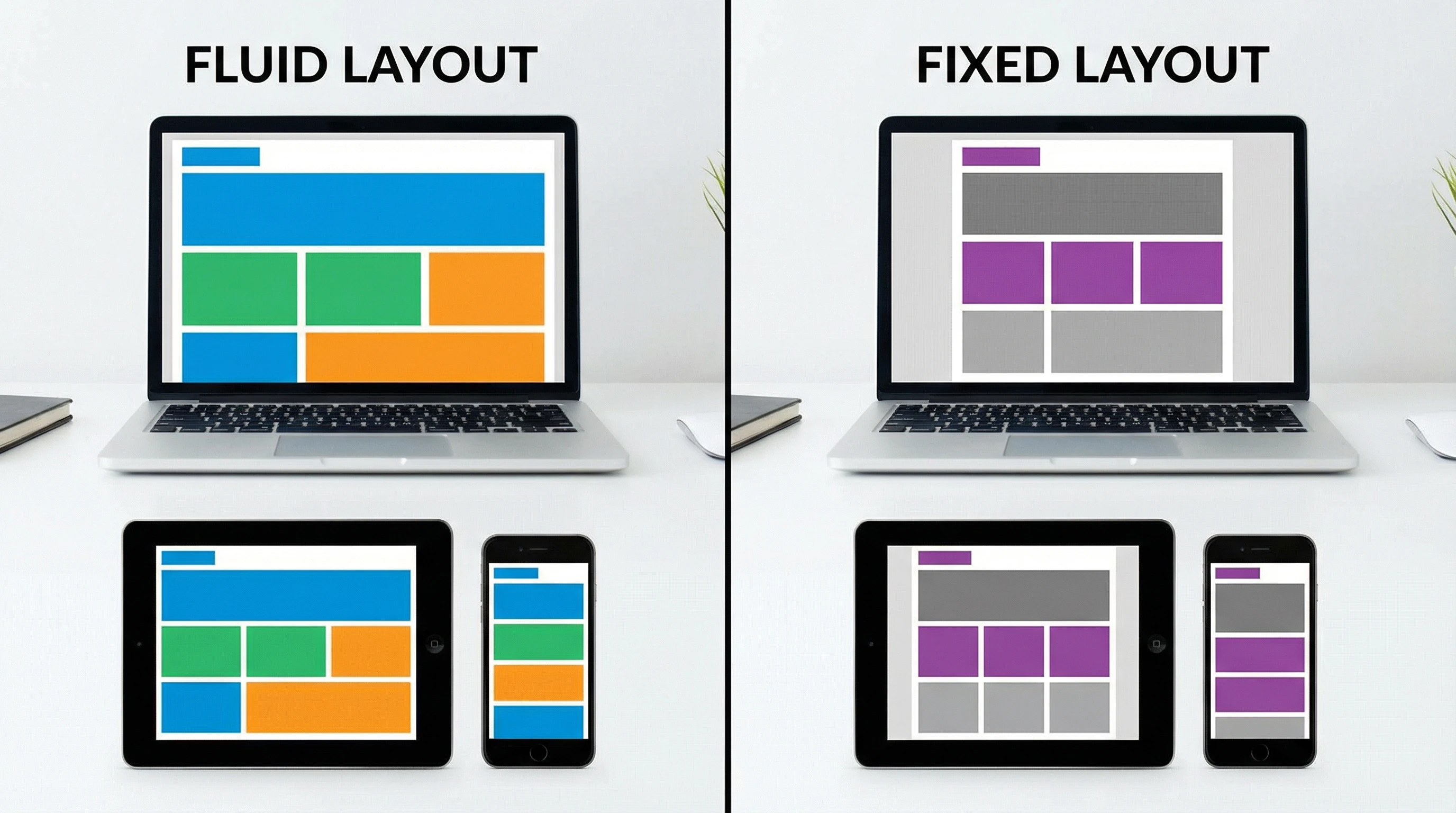
Fluid layouts use percentages for widths, so elements grow or shrink with the browser window. When I build with fluid layouts, I notice how everything—text, images, sidebars—expands to fill the available space. It’s pretty handy for folks browsing on tablets and smartphones or just resizing their browsers.
One cool thing about fluid layouts is that they help websites feel modern and userfriendly. I often choose a fluid layout when I want everything to look good from a wide desktop all the way down to a narrow phone screen. But if you’re not careful, sometimes things end up looking a little stretched out or too squished, especially on really huge or tiny screens.
Fluid layouts are all about flexibility. They make sites easier to use on the go and are sort of the backbone for responsive design (which also adds breakpoints for different devices). When users scroll or resize, everything just flows.
It’s worth noting that fluid layouts have been a big factor in the shift toward more adaptive web design. Since more traffic comes from mobile, folks want a smooth, hasslefree experience. Also, page elements often adapt better to different content lengths, making updates simpler in the long run.
Fixed Layouts: Consistent, Predictable Design
Fixed layouts set pixel widths that stay the same, no matter your screen. When I use a fixed layout, I know exactly how things will line up and look to everyone on a standard monitor. This can be super useful if you’re working with lots of detailed graphics, or you just want total control over how your site appears.
A fixed layout can feel easier to plan since nothing moves around unexpectedly. It’s kind of old school, but it still pops up on many sites that depend on pixelperfect branding or complex visuals. The downside is that on mobile or small screens, users often need to zoom or scroll sideways, which can get really frustrating fast.
If you stick with a fixed layout, keep in mind that today’s users expect easy browsing on their phones. Fixed layouts usually call for a separate mobile version or some extra code to avoid a clunky user experience. Sometimes, layout breakpoints are used with fixed containers to manage this issue.
Which Layout Works Best? Comparing in Action

I get this question a lot: “Should I pick fluid or fixed for my site?” Here’s what I’ve noticed after trying both on tons of projects:
- Fluid layouts fit best when you want your site to “just work” no matter the device—big desktop, small phone, or anything in between.
- Fixed layouts are better if you have tons of graphics, games, or advertisements where exact positioning matters a lot.
- If you want a mix, there’s a “hybrid” option, where fixed width content sits inside a fluid wrapper. This style offers some flexibility without losing your preferred structure.
The right answer really depends on what you’re building. A blog or portfolio? Fluid’s got you covered. An imageheavy landing page with banners and detailed branding? Fixed might work better. Just plan ahead for mobile users.
Keep in mind, some big brands even use hybrid layouts to get that balance; their main content stays readable while important banners or menus stay consistent.
Modern Layout Tips: Getting the Best of Both Worlds
Today, I usually recommend starting with a fluid or responsive layout, especially since so much browsing happens on the go. That doesn’t mean fixed layouts are gone. They just need a little more planning. I like to combine fluid containers with media queries (those special rules in CSS) to tweak layouts for different screens.
Hybrid layouts deserve a shoutout too. They give you that “contained” look with a bit more give for various devices. A lot of designers choose maximum and minimum width settings, so things don’t balloon or shrink in wild ways. It’s a handy balance for realworld websites.
Fluid, fixed, or hybrid—what matters most is that your visitors have a smooth experience. When in doubt, test layouts across devices before your site goes live. Small tweaks make a big difference; running a few tests or simulations can save headaches down the road. Mobilefriendly layouts also help your site rank better in search engines, so it’s worth the effort.
? Your Turn: How Do You Design for Different Screens?
Do you like full flexibility or total control when building websites?
If you’ve played around with different layouts (or you’re brand new), I’d really like to hear what’s worked or didn’t work for your projects. Drop your experiences, tips, or questions below, and let’s help each other build smoother, userfriendly sites for everyone.