

Dynamic websites aren’t just about eye-catching animations or modern templates. At the core, a dynamic website is about creating a flexible and interactive experience that adapts to users and content. Unlike static pages from years ago, dynamic sites pull data from databases, showcase real-time updates, and make interactions feel much more personal. If you care about engaging visitors and keeping them coming back, picking up the basics of dynamic site design is super useful.
Ever wonder how your favorite sites always seem up-to-date and super interactive?
🖥️ Highlighted Strategies
- Smart planning and goal setting before you start coding
- User-centered navigation built for easy movement on any device
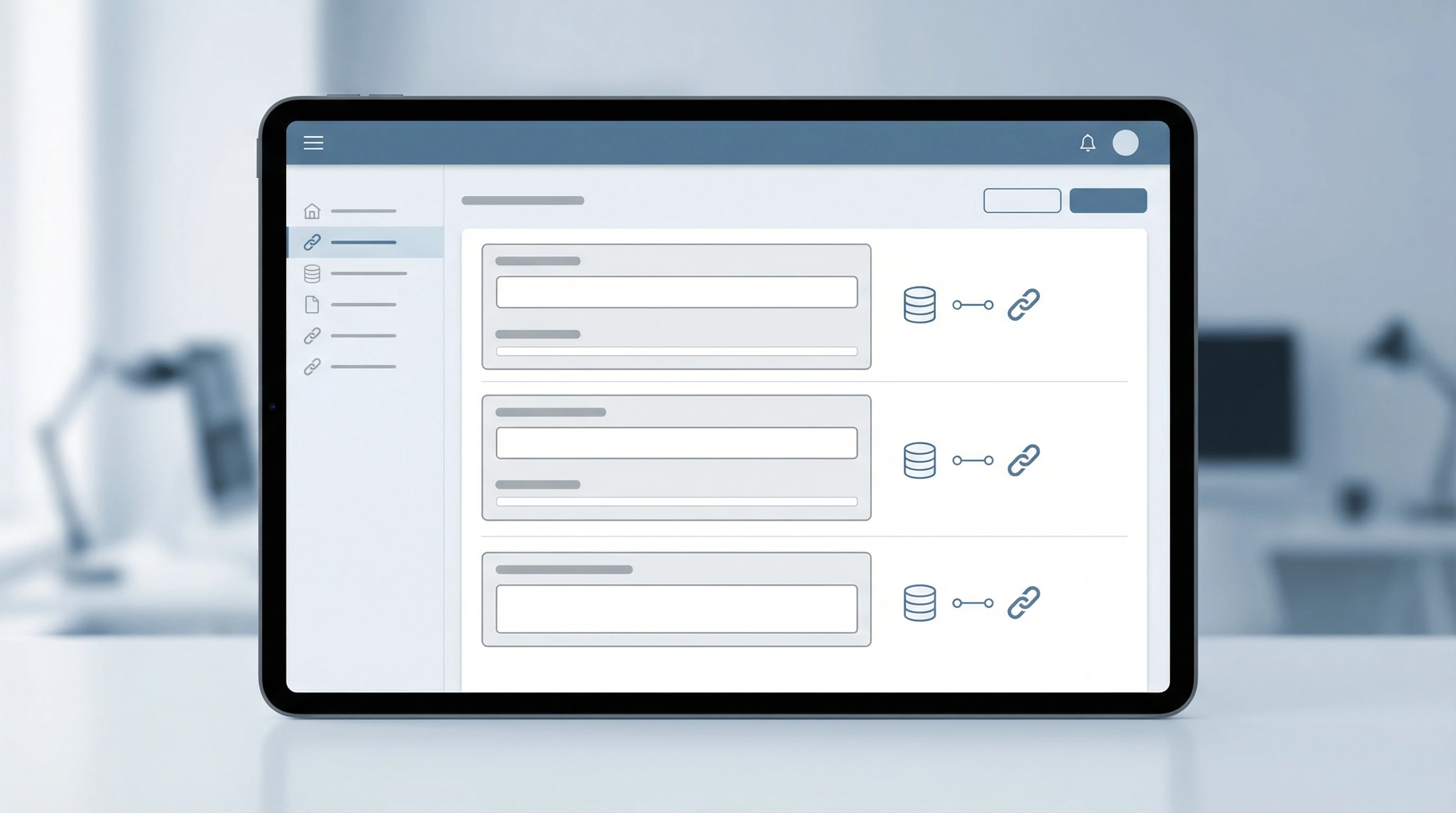
- Database-driven content management for real-time updates
- Responsive design that adapts to all screen sizes
- Integrating APIs and third party tools for added features
- Performance optimization to keep sites snappy and reliable
Understanding the Core of Dynamic Web Design

The main vibe of a dynamic website is its ability to change and react based on user input or new data. In practice, this means using server side scripting languages like PHP, Python, or JavaScript frameworks such as React, Vue, or Angular. These technologies help sites pull information from a database or API, update the page on the fly, and make the user feel like the site is built just for them.
Picture an online store. Product listings, prices, and stock levels change constantly. Instead of manually updating every time, a dynamic site pulls info straight from a database. Even small businesses get massive benefits from dynamic design, since updating content or blog posts becomes way simpler. Setting up these foundations right from the start saves a lot of headaches in the long run.
It’s also worth noting that dynamic design allows for scalability. As your project grows, new features or updated databases can easily be put in place without a major overhaul. This means your site is futureproofed and can keep up with changing needs or a bigger audience. In short, a dynamic site is the way to go if you want something that’ll stand the test of time and tech trends.
Building With User Experience at the Center
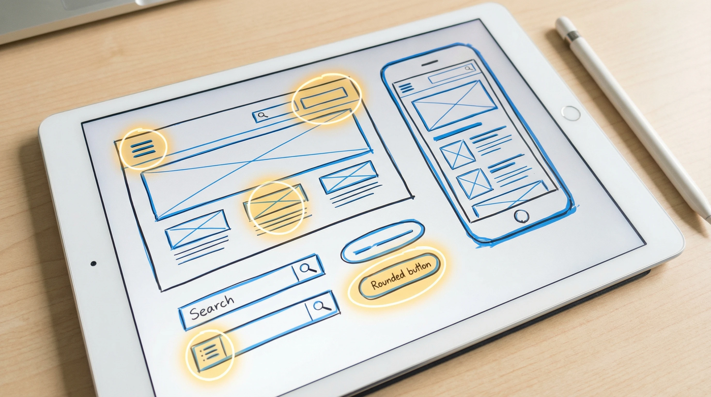
With so many sites online, giving visitors a smooth and enjoyable experience really matters. I always focus on clean navigation, clear calls to action, and layouts that make sense on both desktop and mobile. Responsive design is key because users check out sites from laptops, tablets, and phones. Tools such as CSS Grid, Flexbox, and frameworks like Bootstrap come in handy here.
Personalization is something I almost always add. Using cookies or user accounts, sites can greet visitors by name, remember their preferences, or suggest related products and posts. These personal touches build loyalty and keep people interested. If you want more info on responsive layout ideas, MDN’s Responsive Design Guide is worth checking out for clear advice and examples.
Another UX tip? Run usability tests or show designs to friends or colleagues before launch. Honest feedback can catch confusing layouts or unclear terminology early. Making these fixes upfront saves hassle later and helps your site stand out for all the right reasons.
Smart Content Management and Integrations
A big perk of dynamic websites is how they handle content. Instead of hardcoding each page, you can use a content management system (CMS) like WordPress or custom admin panels to add, edit, or delete content in seconds. Content is usually kept in a database such as MySQL or MongoDB, and pulled into pages dynamically. This setup not only saves time but also cuts down on mistakes and outdated info.
Adding third party integrations gives your site a real boost. Embedding maps, connecting to payment gateways, or pulling in feeds from social media can all make your site stand out while keeping it userfocused. For developers, using APIs means less reinventing the wheel and more delivering features that people actually want.
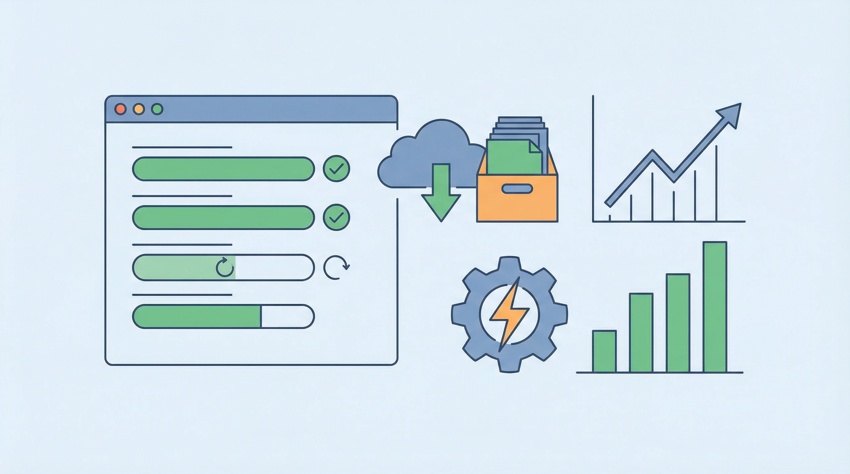
If your site has lots of media, consider using CDNs (content delivery networks) to speed up load times. This makes for a smoother experience and keeps bandwidth costs in check.
Performance, Security, and Ongoing Improvement
Dynamic sites can sometimes get bogged down if you’re not careful, so speed optimization is really important. Lazy loading images, caching data, and compressing files are all moves that keep websites running smoothly. Testing tools like Google Lighthouse or GTmetrix help spot slow pages and fix bottlenecks before users bounce away.
Security is an area that deserves solid attention. Dynamic sites often have forms or login areas, making it vital to keep things safe with HTTPS, regular updates, backup plans, and input validation. These steps go a long way toward peace of mind and site stability, and ensure your site can bounce back quickly if things ever go sideways.
To keep your website truly dynamic, always look for ways to improve based on feedback and analytics. Heatmaps and Google Analytics provide solid data on what real users are doing, letting you adjust or add popular features. This loop of listening and updating keeps your website ahead of the curve and responsive to real needs.
The Takeaway: Dynamic Design Means Long-Term Engagement
Dynamic design isn’t just a buzzword. It’s about mixing good tech with userfriendly ideas for sites that connect with real people. Every step, from smart planning to ongoing improvement, pushes toward a more interactive and effective website. If you’ve got your own story about designing a dynamic site, feel free to share it below. I’m always open to new ideas and experiences that help websites stand out for all the right reasons.
🙌 What’s your favorite dynamic feature on a website?
Drop your thoughts or questions in the comments. I’d love to know which strategies work best for your web projects or what you want to try next!