

Getting device compatibility right is one of those things that helps your website play nice everywhere, from a clunky old tablet to the latest iPhone. When a site is device compatible, it adapts to all sorts of screens, big, small, touch, or even super wide ultrawide monitors. Making sure your site handles all of that isn’t just about the user experience. It’s also about keeping your site visible in search results and usable for everyone who drops by.
Ever tried using a website on your phone and found buttons halfway off the screen?
✔️ Key Points for Device Compatibility
- Understanding what device compatibility covers
- How responsive design works in the real world
- Tools and methods for testing compatibility
- Optimizing images and media for all devices
- Accessibility and usability considerations
- Why regular updates and checks matter
What Device Compatibility Really Means
Device compatibility means your website looks and works right on any device. This isn’t only about shrinking text to fit a phone’s display. I’m talking about menus you can actually tap with your finger, images that don’t wreck the layout, and features like embedded maps or videos that still load quickly, even on a budget Android device.
If your site isn’t device compatible, it can frustrate visitors, spike your bounce rates (meaning people leave quickly), and even hurt your rankings in search engines like Google. There’s a lot at stake for something that seems pretty simple at first glance. Even slight differences in screen size or device software can make a big difference in how your site displays.
Responsive Web Design: The Backbone

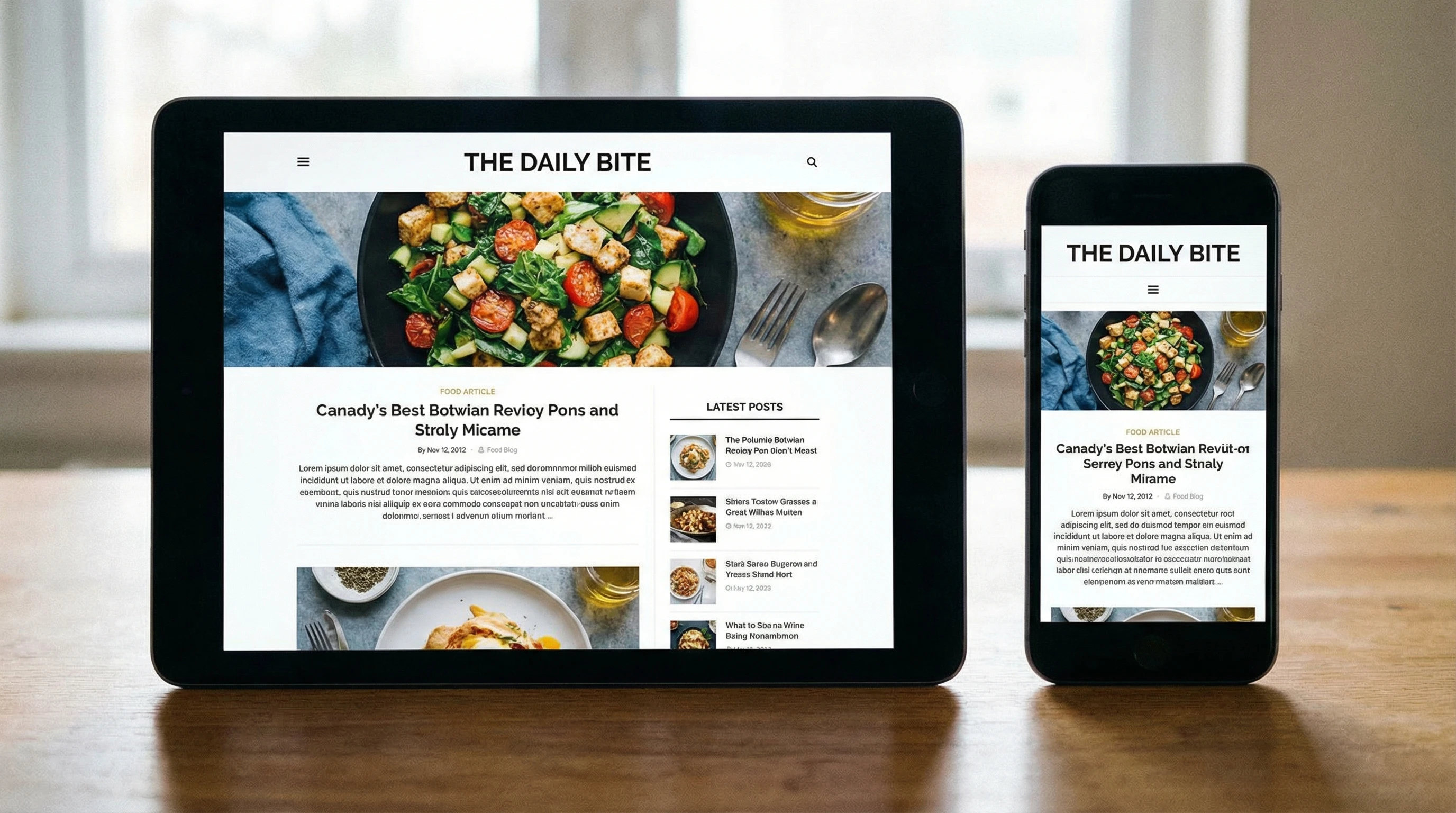
Responsive design is the main way people build device compatible sites. I use flexible layouts and media queries in CSS to make content flow and snap into place based on the user’s screen size. So, whether I’m holding my phone vertically or viewing content on a huge desktop monitor, the site just works.
It’s not just about layout, either. Responsive design covers image scaling, font size, navigation menus, and even which features are available or hidden on certain device types. Google recommends responsive design because it means a single URL for every device, which helps with both user experience and SEO. Responsive web design removes the need to build separate mobile and desktop versions of a website, making your content easier to manage and keeping visitors happy no matter what device they use.
Testing Device Compatibility: Tools and Tactics
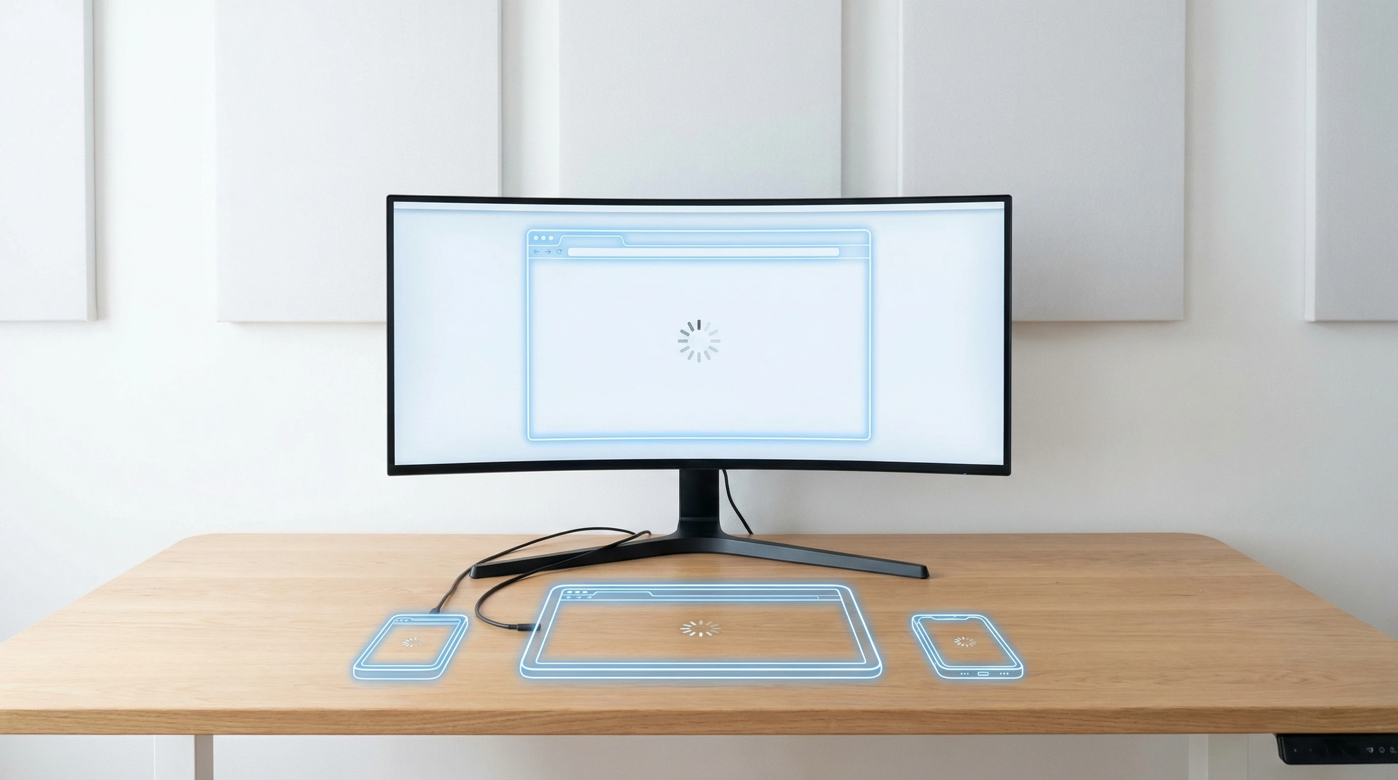
I always test my websites in real browsers on real devices whenever possible. Emulators and simulators (like Chrome’s Device Mode or BrowserStack) are pretty handy for checking multiple screen sizes without hunting down every device yourself. For a closer look, Google’s Mobile-Friendly Test and Lighthouse (built into Chrome DevTools) point out usability or loading issues fast.
If you’re just starting, try viewing your site on your laptop, a tablet, and your phone—in both portrait and landscape modes. Watch out for navigation that suddenly vanishes, awkward overlapping text, and media that just won’t shrink properly. Reach out to friends or colleagues and ask them to test your site on their devices too. A wider range of real world data will help you spot subtle issues.
Another great way to check is to regularly use your analytics to see which devices and browsers your visitors actually use. Focus your testing efforts where they matter most for your audience.
Optimizing Images and Media for Any Screen
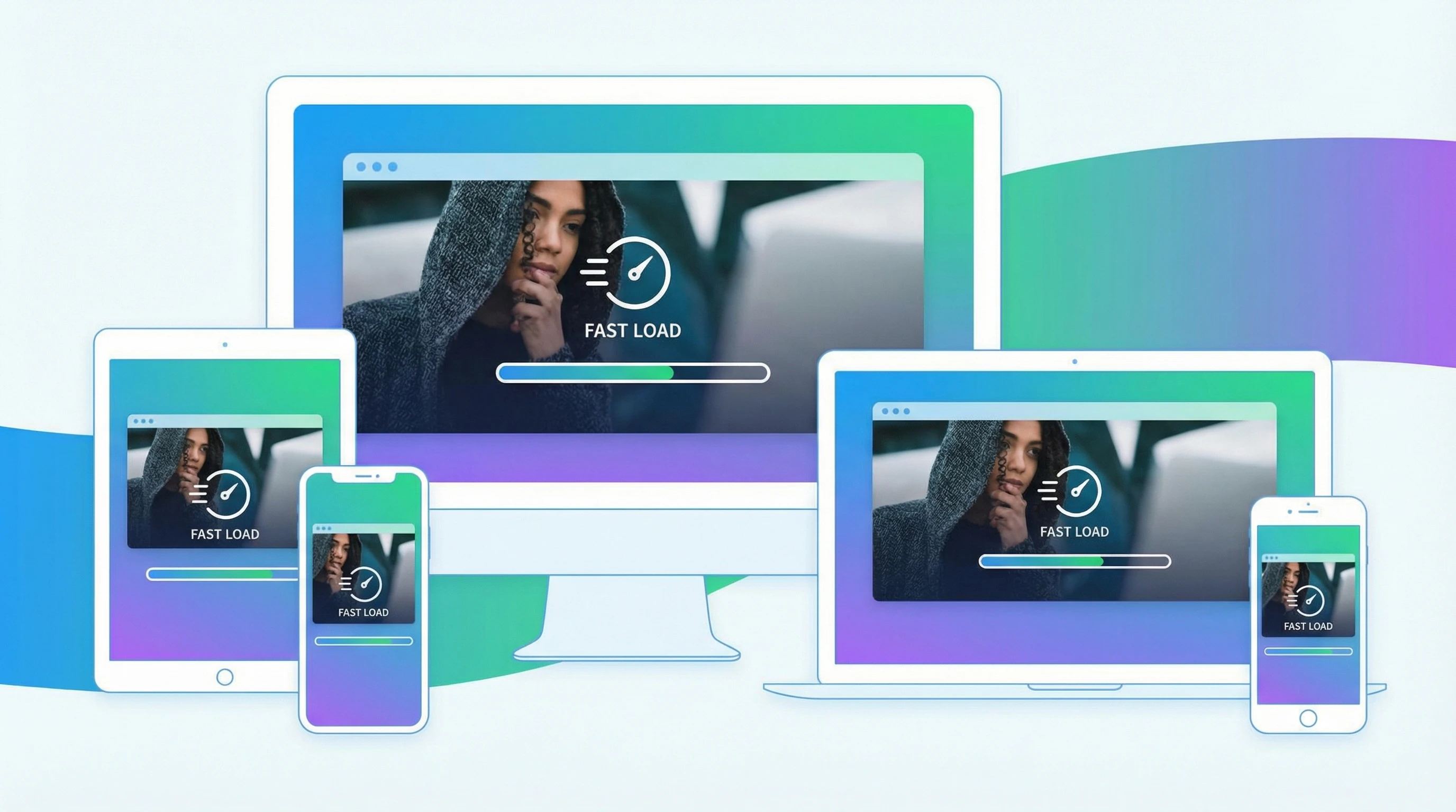
Large, slow-loading images are one of the biggest culprits in ruining a site’s mobile experience. I always use responsive image methods like srcset in HTML, so the browser can pick the right size image for the user’s screen. Compressing your images (with free tools like TinyPNG or Squoosh) goes a long way too, keeping things speedy no matter how someone visits your site.
Videos and other embedded media need attention as well. I use responsive containers for things like YouTube embeds, so they resize with the screen and don’t stretch out too far or clip off content. If you have interactive elements—a slideshow or custom graphics—make sure they’re coded to scale up or down as needed.
Pay attention to file types too. WebP images, for example, offer smaller file sizes and solid quality. The key is making sure every user sees a sharp, fast-loading version of your content regardless of device.
Accessibility and Usability Go Hand In Hand
Device compatibility isn’t just about looks. I check that buttons are a good size for thumbs, text is readable without zooming, and interactive elements such as forms are easy to use whether you’re tapping or clicking. Adding text for images (using alt attributes), picking strong color contrast, and making sure keyboard navigation works helps everyone—including people using assistive tech.
Accessibility often overlaps with device compatibility more than you might realize. If your site is set up to welcome as many users as possible, regardless of device or ability, you get a broader reach and happier visitors. Make accessibility a priority, not an afterthought, because it boosts real world usability for all your users.
Keep It Up: Regular Checks and Updates
Browsers and devices get updated constantly. I schedule regular checks on my sites to catch anything new that breaks the layout or causes features to glitch. Even popular plugins and site builders release updates that can change how elements display across devices, so staying on top of things is super important.
If you run a business or a blog, these regular updates protect your SEO rankings and keep people coming back. Staying current ensures your site just works, every time. An outdated site can frustrate visitors or accidentally lock out users with newer devices.
💡 Final Thoughts
Device compatibility is one of the best ways to make your website feel professional and welcoming. Whether you’re launching a side project or running a fullblown online store, it’s worth making sure every visitor gets a smooth ride no matter the device in their hand or on their desk.
What’s your biggest challenge with device compatibility?
I’d love to hear how you approach testing or if you’ve got favorite tips and tools. Drop your thoughts below and let’s swap ideas for better, smoother websites!