
Website responsiveness is all about how smoothly a site adapts to different screen sizes and devices. Whether you’re browsing on your phone, tablet, or desktop, a responsive site should look great and work well no matter what you’re using. Testing for responsiveness is really important for building trust with visitors, improving user experience, and making sure your site shows up more often in search results.
Ever tried visiting your own website on a phone and found things out of place?
🔑 Main Ideas
- Responsive design basics and why it matters
- Manual testing with real devices and browsers
- Handy online tools for faster testing
- Common issues to watch for
- Best practice tips for reliable results
- Why regular testing keeps your site looking good
Understanding What Makes a Site Responsive
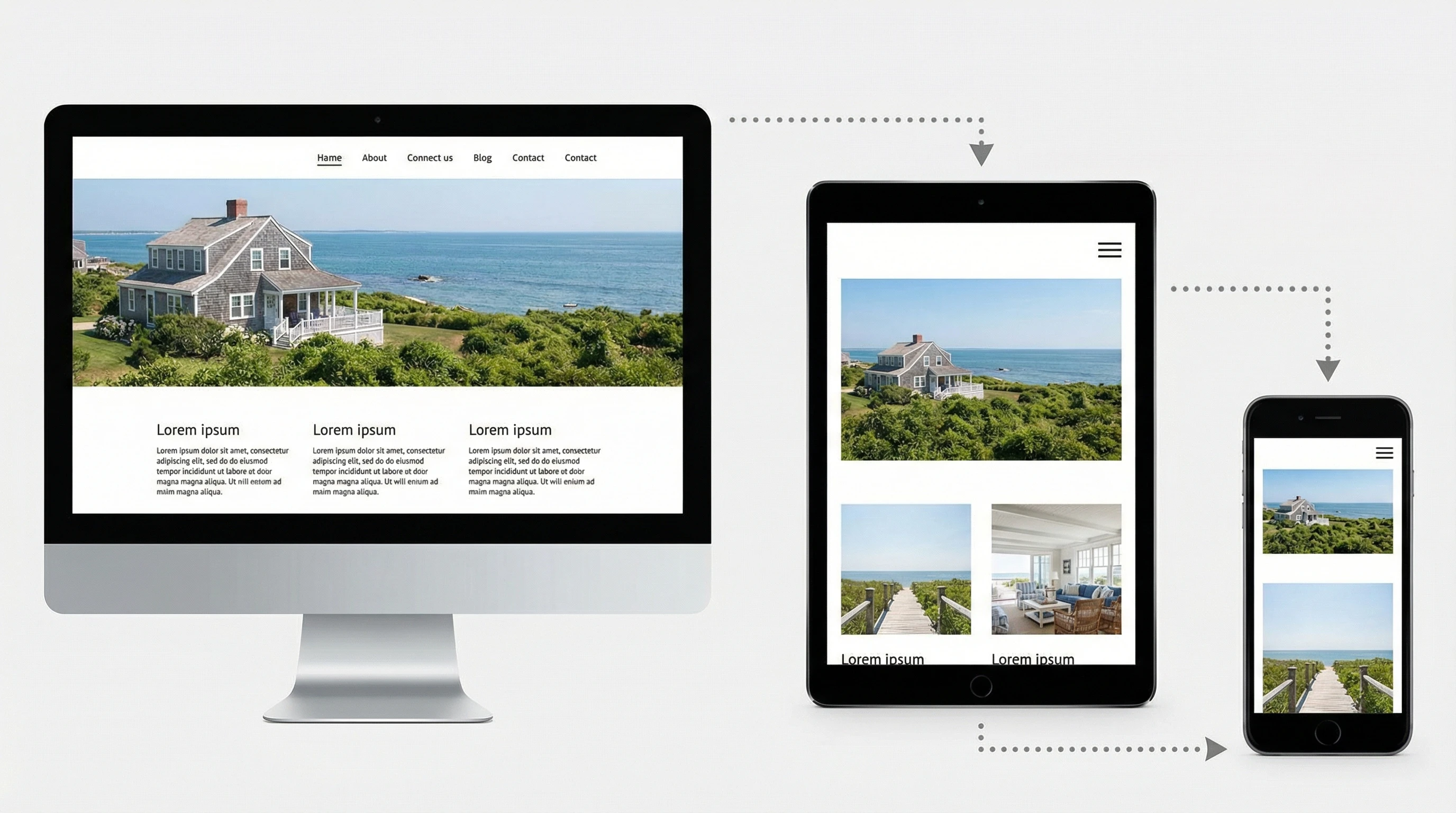
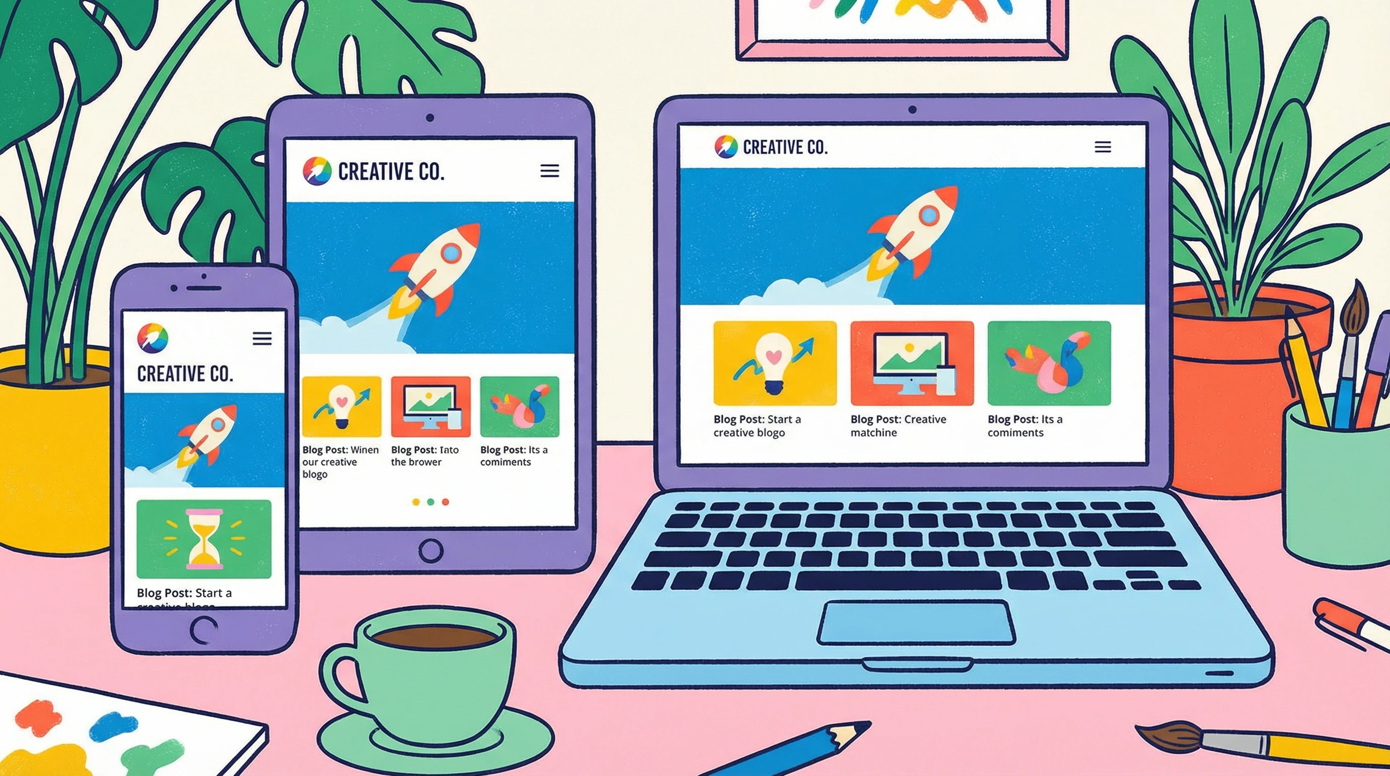
At its core, responsive design means your site uses flexible layouts, adaptable images, and clever CSS to automatically change its look and feel depending on the device. For example, menus transform into dropdowns on mobile, images shrink or expand to fit their containers, and text stays readable. If you’ve ever noticed a site where you don’t need to pinch, zoom, or horizontally scroll, it likely uses responsive design well. A responsive site helps users avoid pinching, zooming, or endless scrolling since the content already fits their screen. Google also likes responsive sites because they give visitors a better experience. That can help with your search rankings and bring in more traffic.
Responsive sites aren’t just about looks—they impact how users interact with your content and influence whether visitors stay or leave. From easier navigation to faster page loads (since mobile users are often on slower connections), the benefits are clear. Keeping your design flexible means your site is ready for future devices and screen sizes as well.
Testing Responsiveness With Real Devices

Nothing beats checking your site on actual devices. Browsing your website on a mix of smartphones, tablets, laptops, and even smart TVs lets you see how things really look. It’s smart to keep a checklist—click all the menus, try forms, scroll through long content, and check the footer. If you can spot things like overlapping buttons, offcentered logos, or unreadable text, you’re already ahead of the game. Not everyone has dozens of devices, but borrowing from friends and checking with older models can give you extra coverage.
This hands-on approach helps you catch tiny issues, like misaligned buttons or touch targets that are too small. Sometimes devices that seem similar, like two different Android phones, actually display sites very differently. Real-world checks make a big difference, especially before big launches or after major updates.
Online Tools and Browser Features That Make Life Easier
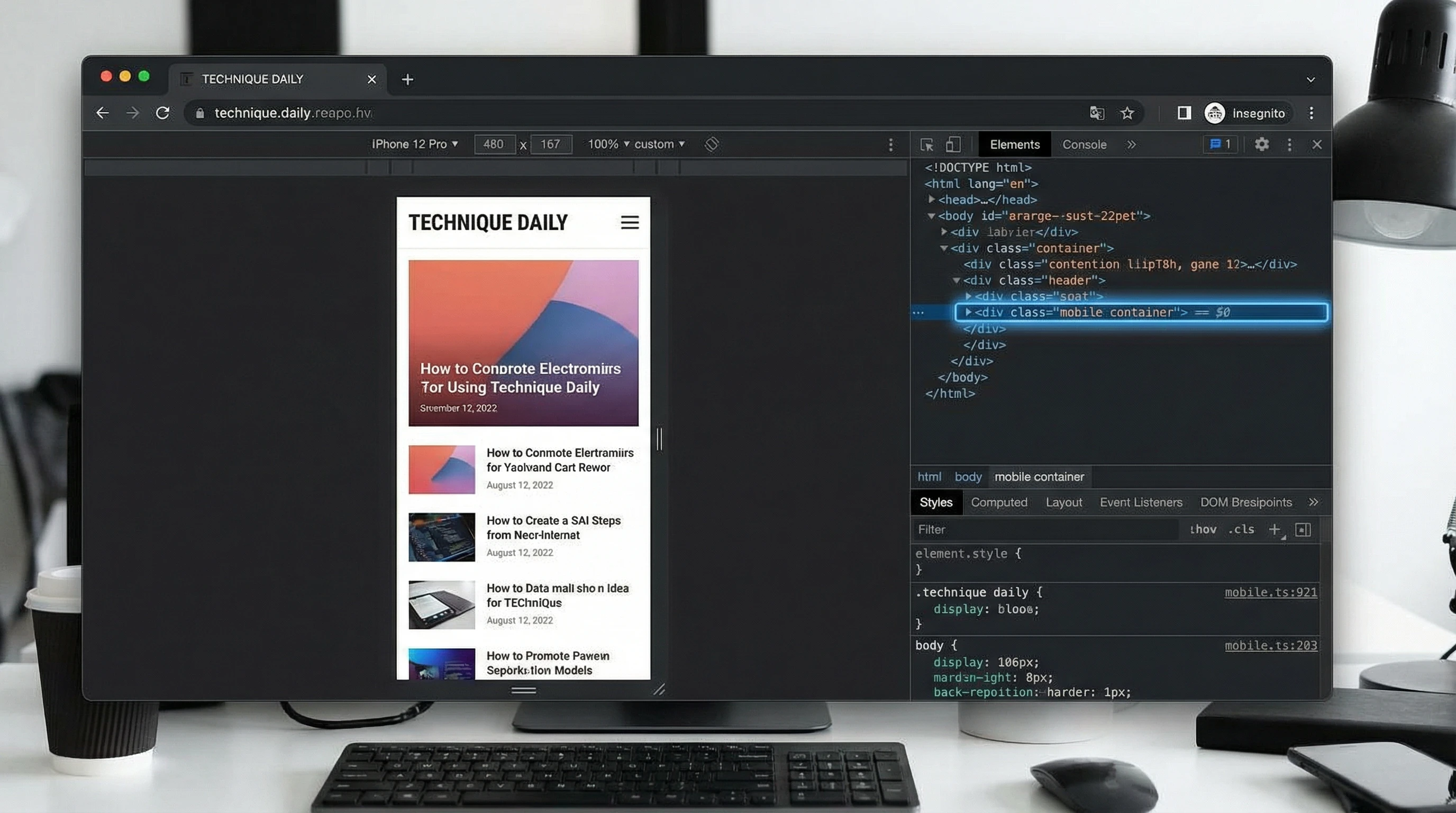
Online testing tools are great for quick checks. Tools like Google Chrome’s DevTools let you switch between device sizes with just a click. There’s also BrowserStack and Sauce Labs if you want to see your site on hundreds of device and browser combinations—no need for extra hardware at your desk. Free tools like Responsinator or Screenfly give a fast way to see how your site looks on popular screen sizes.
While these tools can’t catch every bug, they do help you spot major problems fast. Browser features often let you simulate slow networks or switch to landscape and portrait orientation, giving you a fuller picture. They’re especially handy if you don’t have lots of physical devices to test on.
Most Common Website Responsiveness Issues to Watch

Some issues pop up again and again. Images might stretch weirdly or disappear, navigation bars can run right off the screen, and clickable buttons sometimes get way too tiny. Make sure to test contact forms, popups, and carousels. Fancy features like sliders and popups are more likely to break on small screens. Slow loading times can also mess with responsiveness, especially if your site uses big images or unoptimized code. When you spot these problems early, you can fix them before visitors notice.
Other common problems include font sizes shrinking too much, tap targets being hard to hit, and menus not collapsing correctly. Sometimes, things look perfect on your computer but break on a friend’s phone, so checking with different hardware pays off.
Tips for Smoother Testing and Better Results
- Always test in both portrait and landscape orientation
- Check with multiple browsers like Chrome, Firefox, Safari, and Edge
- Don’t forget accessibility—try navigating with only a keyboard or a screen reader
- Keep a mix of the latest and older device models in mind while testing
- Update your site regularly, since even small changes can bring back old problems
Getting into the habit of testing your site’s responsiveness helps you spot problems before your visitors do. It also shows Google and other search engines that your site is reliable, which can help boost your rankings. With a few simple checks and tools, you can keep your site looking awesome and running smoothly on any device.
💡 What’s Your Favorite Tool for Testing Responsiveness?
Got a go-to trick for checking your site on different devices?
Share your approach in the comments. Your experience might help others keep their websites looking sharp across every screen and device out there.