
Responsive web design isn’t just a passing trend; it’s quickly become the core of building websites that work well for everyone, everywhere. In 2026, I’m spotting some fresh approaches that make sites smoother, faster, and a lot more visually exciting no matter what device you’re on. Responsive design goes way beyond just making things shrink to fit your phone. It’s about real usability, creativity, and accessibility all rolled into one package.
Ever found yourself frustrated when a site’s buttons or menus go wonky on your phone?
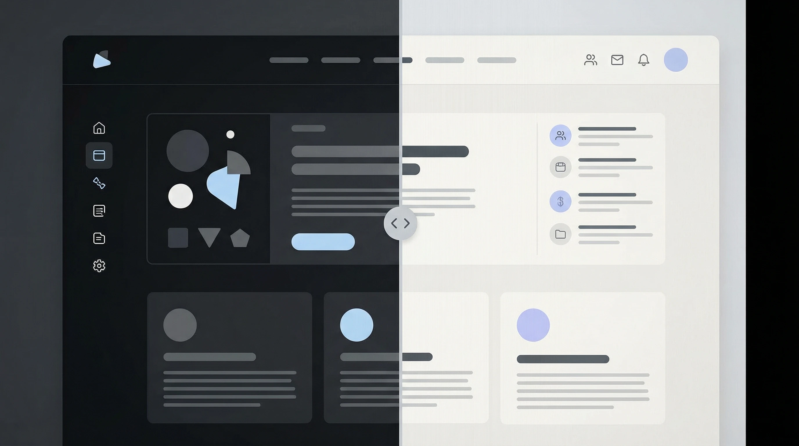
Top Responsive Design Trends to Watch Right Now
- Fluid grids and flexible layouts that adjust gracefully to any screen
- Variable fonts and modern typography for legible, stylish text everywhere
- Mobilefirst animations and microinteractions that feel great on any device
- Contentfirst user experience for faster loading and easier navigation
- Dark mode and custom theming with usercontrolled settings
- Better accessibility tools for everyone, regardless of device or ability
Flexible Grids: Designs That Really Move With You
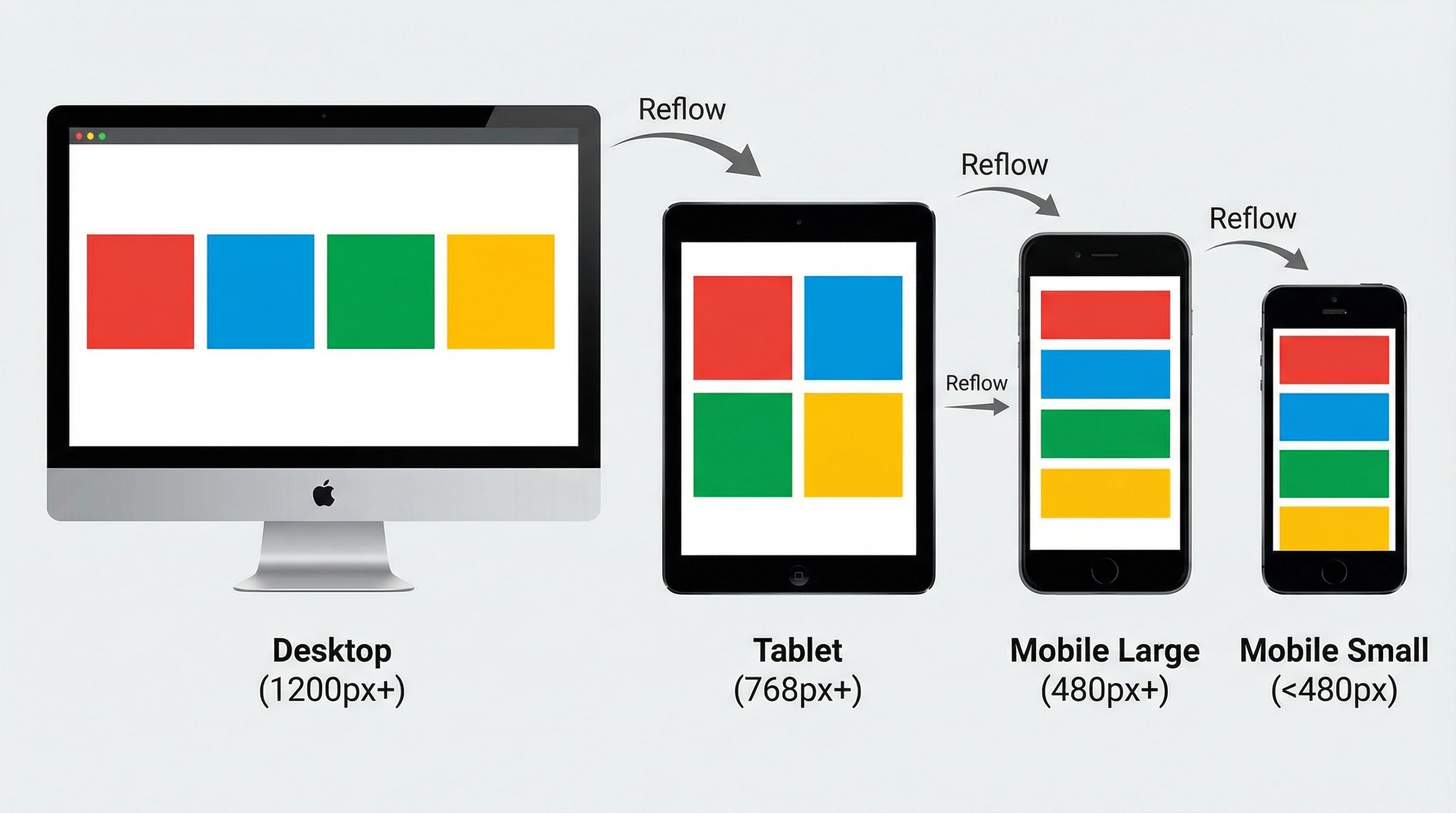
Oldschool responsive design often leaned hard on breakpoints: desktop, tablet, mobile and finished. Now, I’m noticing designers use fluid grids and flexible containers so layouts adjust nicely at any width. There’s no more guessing where those awkward gaps might pop up. Modern CSS tools like flexbox and CSS grid let you build sections that adjust instantly, and container queries let you fine-tune individual pieces for even more polish. As a result, every user, no matter how unusual their screen is, gets a version that feels tailored and smooth. Adjusting layouts seamlessly helps to keep users engaged and satisfied with your site, even when they’re switching between different devices throughout the day.
Typography Evolves: Variable Fonts and Adaptive Styles
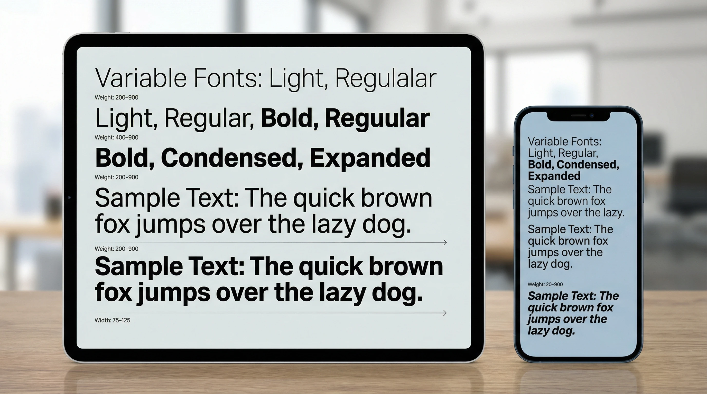
No site feels modern if the text is squished or blows up too big. Variable fonts are game changers here; they adjust weight, width, and even optical size dynamically so text reads perfectly on a big monitor or a tiny phone. Sites in 2026 regularly offer customizable font scaling so users can pick what feels best for their eyes. I’ve found that combining high contrast and big touch friendly targets helps everyone, including people with lower vision or those just scrolling on a sunny day outside. Creative typefaces now mix in expressive, legible styles that maintain personality, all while working smoothly across platforms. Keeping text clear, beautiful, and adaptable is now easier than ever.
Animations and Microinteractions for Every Device
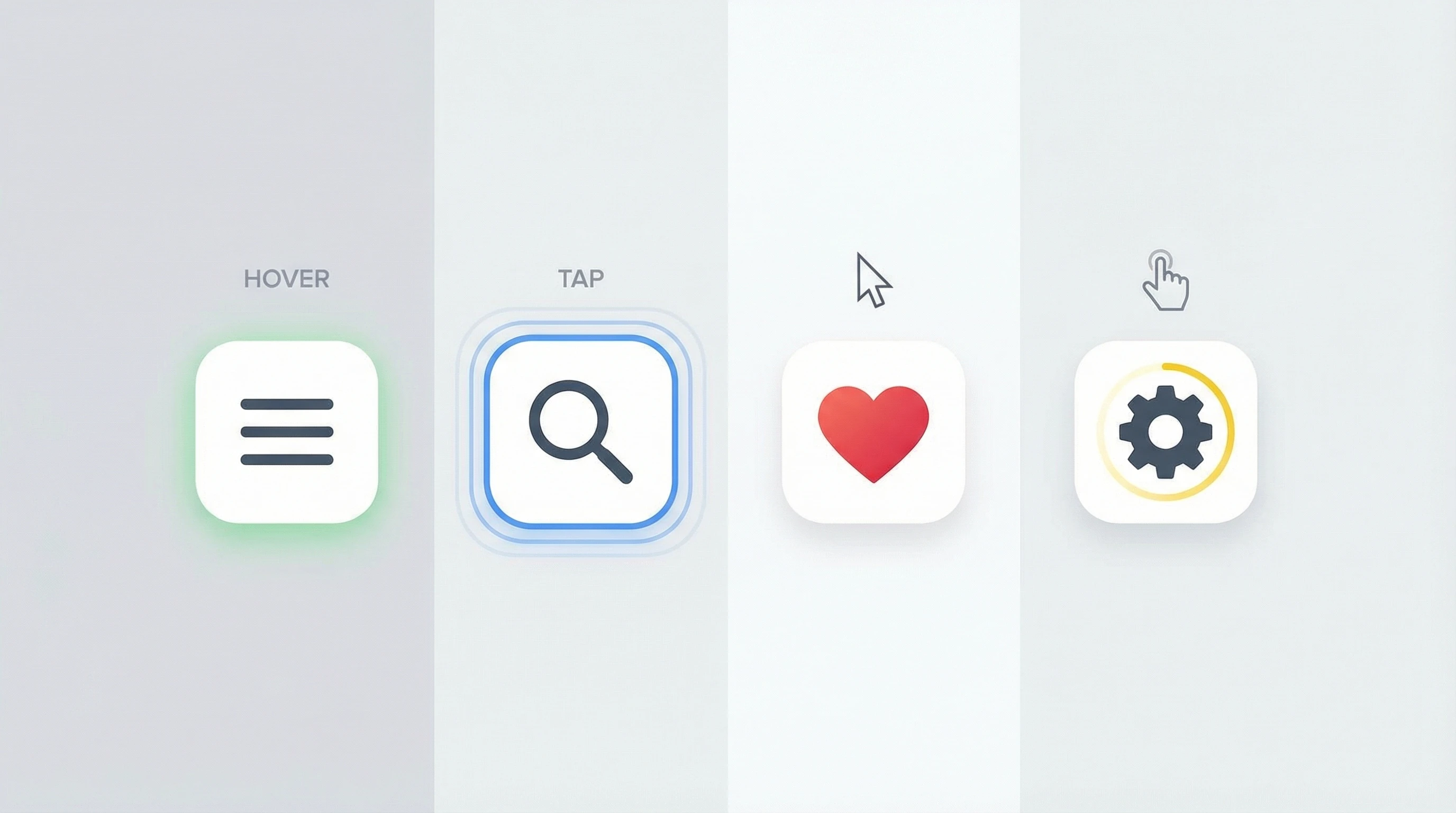
Animations add personality and help guide users, but only if they work everywhere. Modern frameworks deliver hardwareaccelerated animations that run smoothly on older phones and tablets. I’m seeing designers use microinteractions like animated buttons or feedback for form submissions. These keep mobile experiences fun and clear without slowing anything down. Plus, smart tools let users opt out if animations get distracting or trigger motion sickness. This is especially helpful for accessibility, making sure nobody gets left out. Microinteractions, when executed well, give a boost to your site’s overall feel and make it more engaging for everyone.
ContentFirst Design: Speed and Usability on Every Screen
Mobile browsing in 2026 is all about speed. Content first design means starting with the information people actually want — text, calls to action, and actionable links — then layering on images and extras only as they’re needed. Responsive image delivery (using techniques like srcset and lazy loading) helps load times stay snappy. CSS media queries serve just the right layout and artwork for each screen. This approach is really important for Core Web Vitals scores, giving visitors less waiting and more doing. It means users get what matters first, whether they’re on a fast home connection or using public WiFi on the go.
Personalization and Theming: Giving Users a Say
Visitors have strong preferences these days. Support for dark mode, custom accent colors, and even font changes means people stick around longer, and they’re more comfortable, too. Many sites now offer user toggles that stick between visits or even match what your device already picked up. This level of personalization, along with improved keyboard controls and skip links, makes experiences more inclusive for all users. For more, check out the WCAG guidelines. Features like these show users you care about their unique needs and preferences.
What Responsive Design Means For You in 2026
Responsive design right now is about flexibility and user choice. Tools have improved a ton, but the focus is still on making sure every person — regardless of their needs or tech — can see, interact with, and enjoy your website like it’s meant to be used. Whether you’re building a site for the first time or just want to give your current one a boost, these trends are definitely worth checking out. If you want to make your site stand out, keeping these tips in mind will help your design shine.
How Are You Adapting?
What’s something you’ve seen lately in responsive design that surprised or impressed you?
Share your favorite trends, brainstorms, or questions in the comments below. I’d love to hear how you’ re making your sites feel great for every visitor!