Web design doesn’t really have a one size fits all setup. The style you end up using can help tell your brand story, shape how visitors feel about your business, and make everything easier, or tougher, to use depending on what you pick. There’s a lot out there, from bold minimalism to lively maximalist sites, and each approach comes with some unique perks and a few things that might trip you up. Picking the best fit for your website takes a little thinking about what you’re going for and what your audience expects. Let’s jump into the main web design styles out there and see what suits different brands and audiences.
Ever wondered which web design style would be a great fit for your project?
Quick Breakdown: Main Types of Web Design Styles
- Minimalist design
- Maximalist (expressive) design
- Flat design
- Material design
- Illustrative and artistic design
- Retro and vintage design
- Modern corporate design
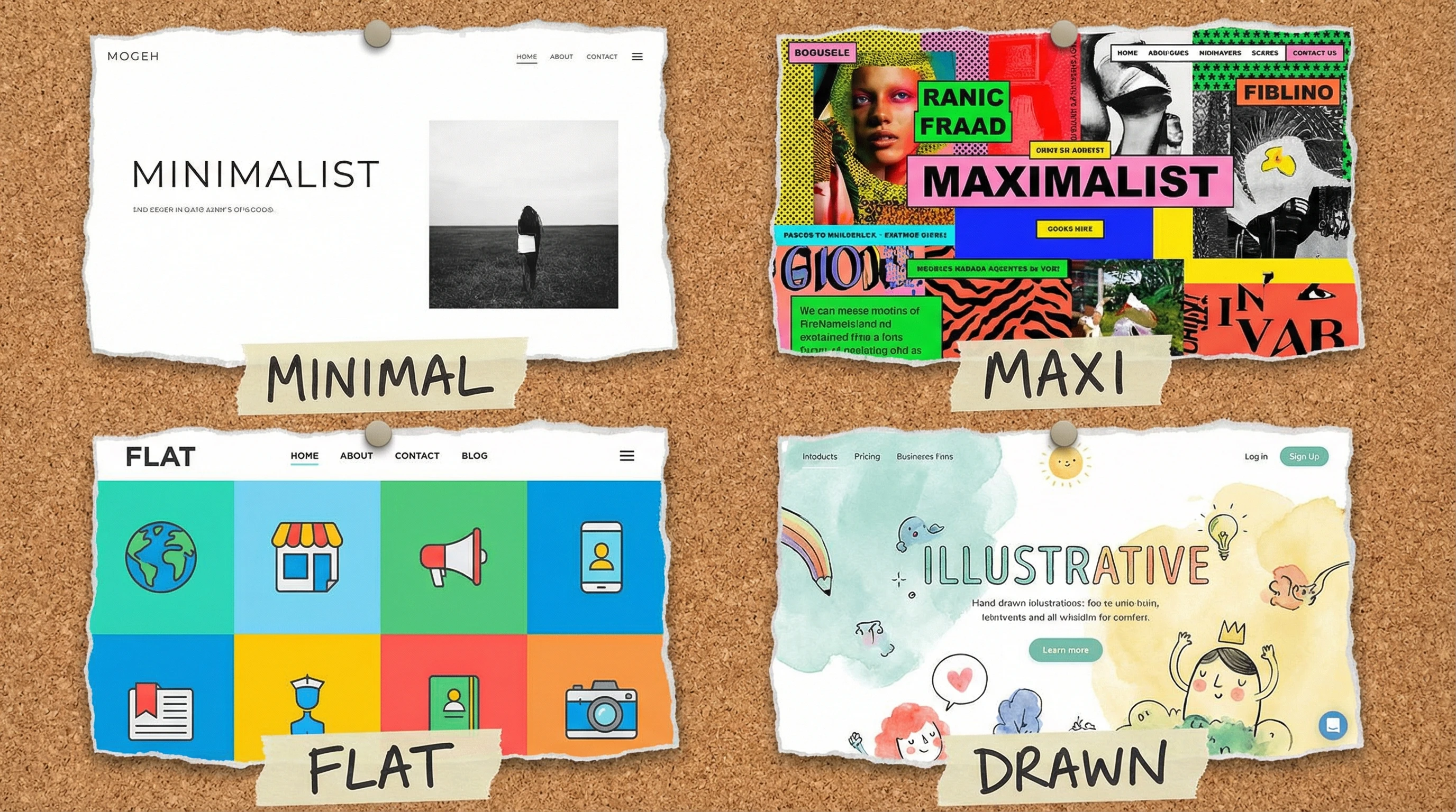
Minimalist Design: Clean and Straightforward
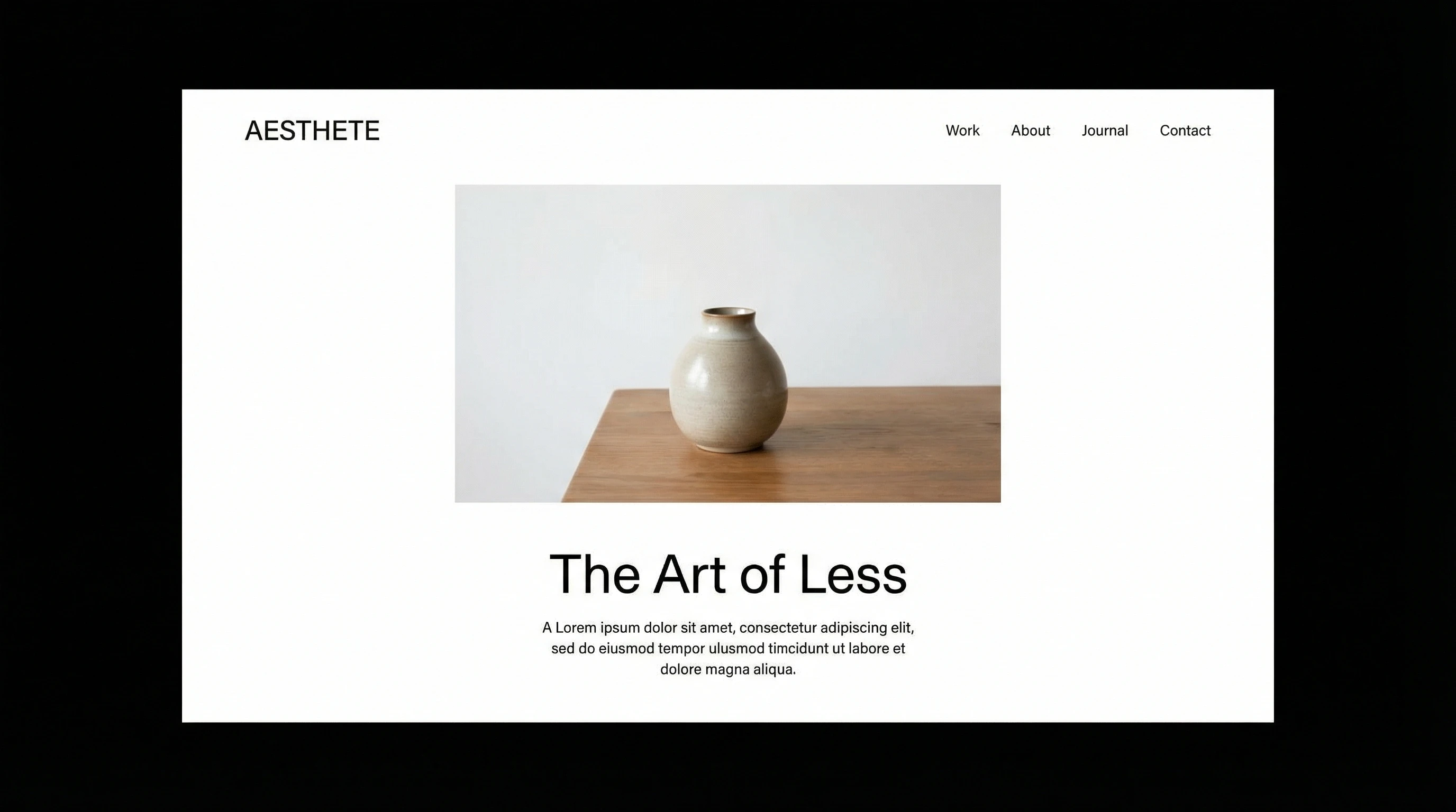
Minimalist sites focus on whitespace, simple navigation, and a “less is more” approach. I’m a big fan of how uncluttered they can feel. Everything has its place and it’s easy to focus on what matters most because distractions are stripped away. Minimalism puts your message front and center without fuss.
Pros:
- Fast load times. Fewer graphics make things speedy.
- Easy for users to navigate and read.
- Looks good on both desktop and mobile devices.
Cons:
- Can feel generic if you’re not creative with the layout.
- Doesn’t suit brands that want to show lots of personality.
Minimalist websites are popular with cutting edge tech companies, lifestyle blogs, and anyone aiming for a premium, trustworthy look. They step up usability, too, since visitors aren’t overwhelmed.
Maximalist Design: Bold, Busy, and Attention-Grabbing
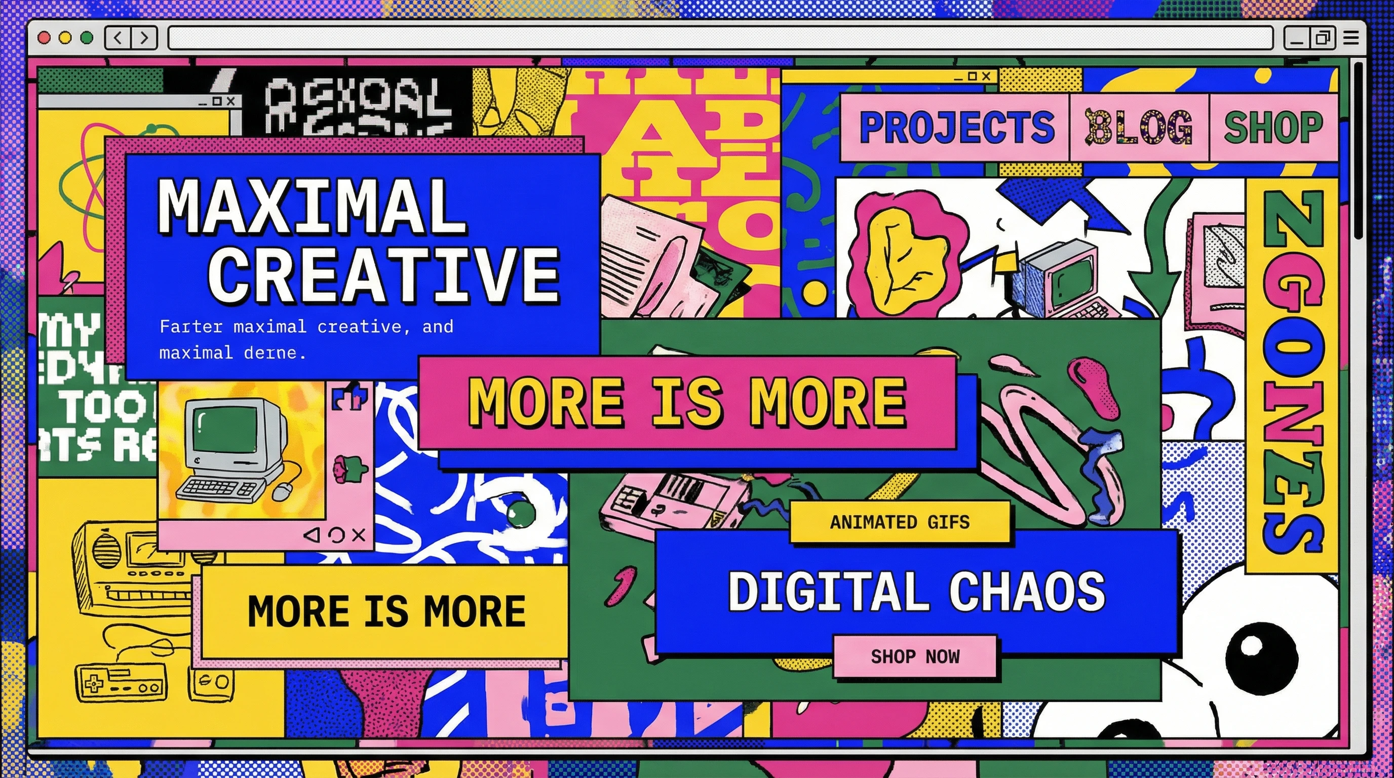
Maximalist web design goes all out with lots of colors, busy layouts, unique fonts, and plenty of visual elements. If you want a website that makes people say “wow” and shows off some big personality, this style is worth checking out. The energy this approach gives can be next-level cool and memorable, but you’ve got to keep things balanced to avoid chaos.
Pros:
- Stands out from the crowd.
- Lets you express creativity and uniqueness.
- Fun for portfolio and creative agency sites.
Cons:
- Easy to go overboard and confuse visitors.
- Can slow down site speed if overloaded with images or effects.
- Not always best for business or professional sites.
Maximalist styles are extra engaging for entertainment sites, art galleries, music, and trendy startups who want a big impact.
Flat Design and Material Design: Bright, Playful, and Modern
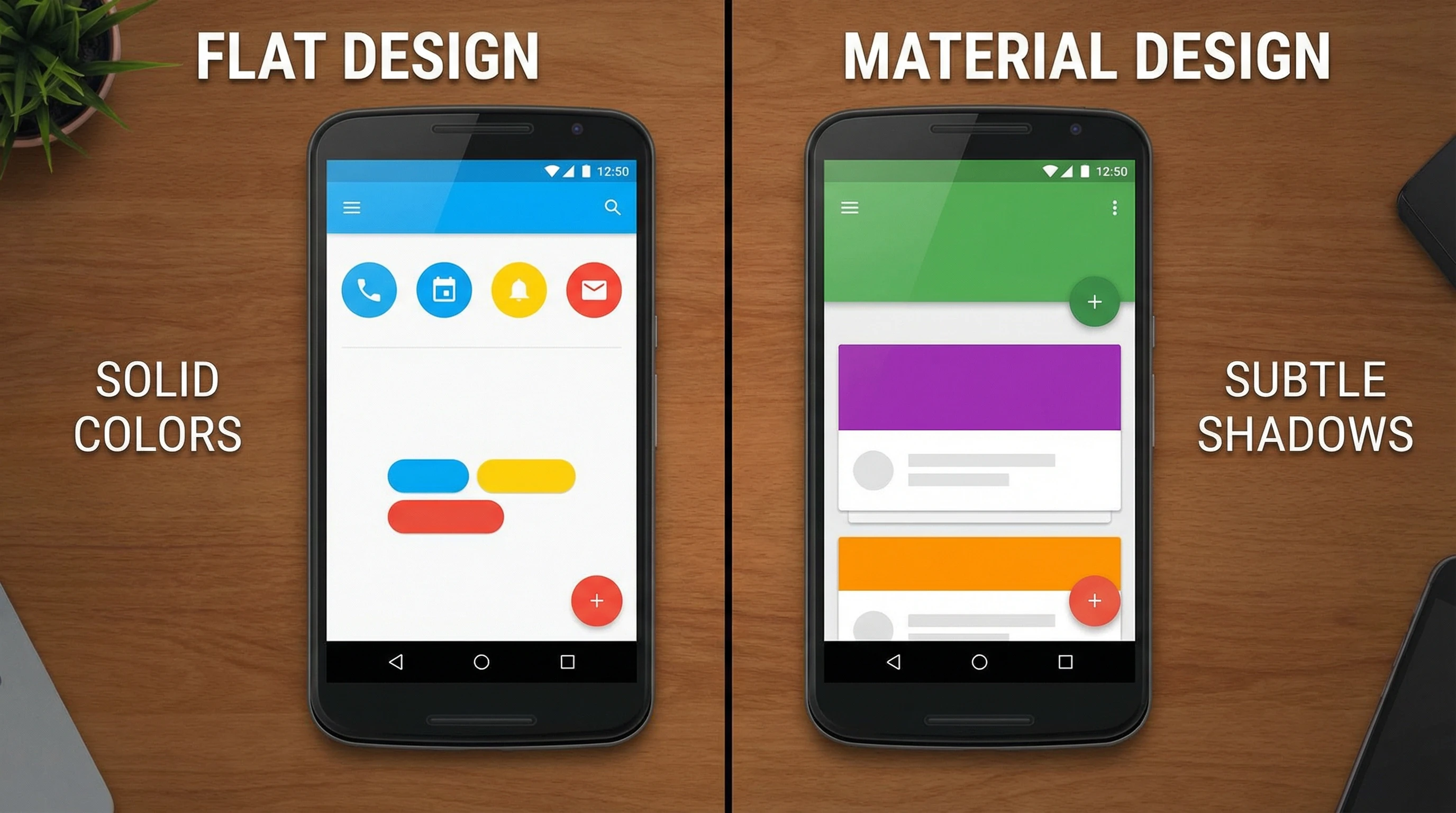
Flat Design
Flat design skips fancy effects like shadows and gradients, going for a crisp, simple look. Solid colors, sharp edges, and easy to read fonts are the main vibe. Apps and tech brands love this style because it feels fresh, simple, and modern. Flat design is easy for visitors to get a feel for and find information quickly.
Pros:
- Makes information super easy to find.
- Clean and approachable look.
- Works great with icons and infographics.
Cons:
- Lack of visual depth can make clickable elements unclear.
- Sometimes feels a bit too plain for bold brands.
Material Design
Google’s Material Design adds depth with shadows, lighting, and layers, but keeps layouts tidy with a grid system. It gives a more tactile vibe without taking things too far visually. Google uses this on many of its apps to keep them feeling friendly and easy to use. You’ll spot material design in lots of mobile apps and business websites these days.
Pros:
- Intuitive. Realistic cues help people know what’s clickable.
- Consistency across devices and platforms.
- Visually engaging but still organized.
Cons:
- Can get complicated quickly if you go heavy on effects.
- Not as flexible for ultra simple brands.
Illustrative, Artistic, and Vintage Designs: Unique and Memorable
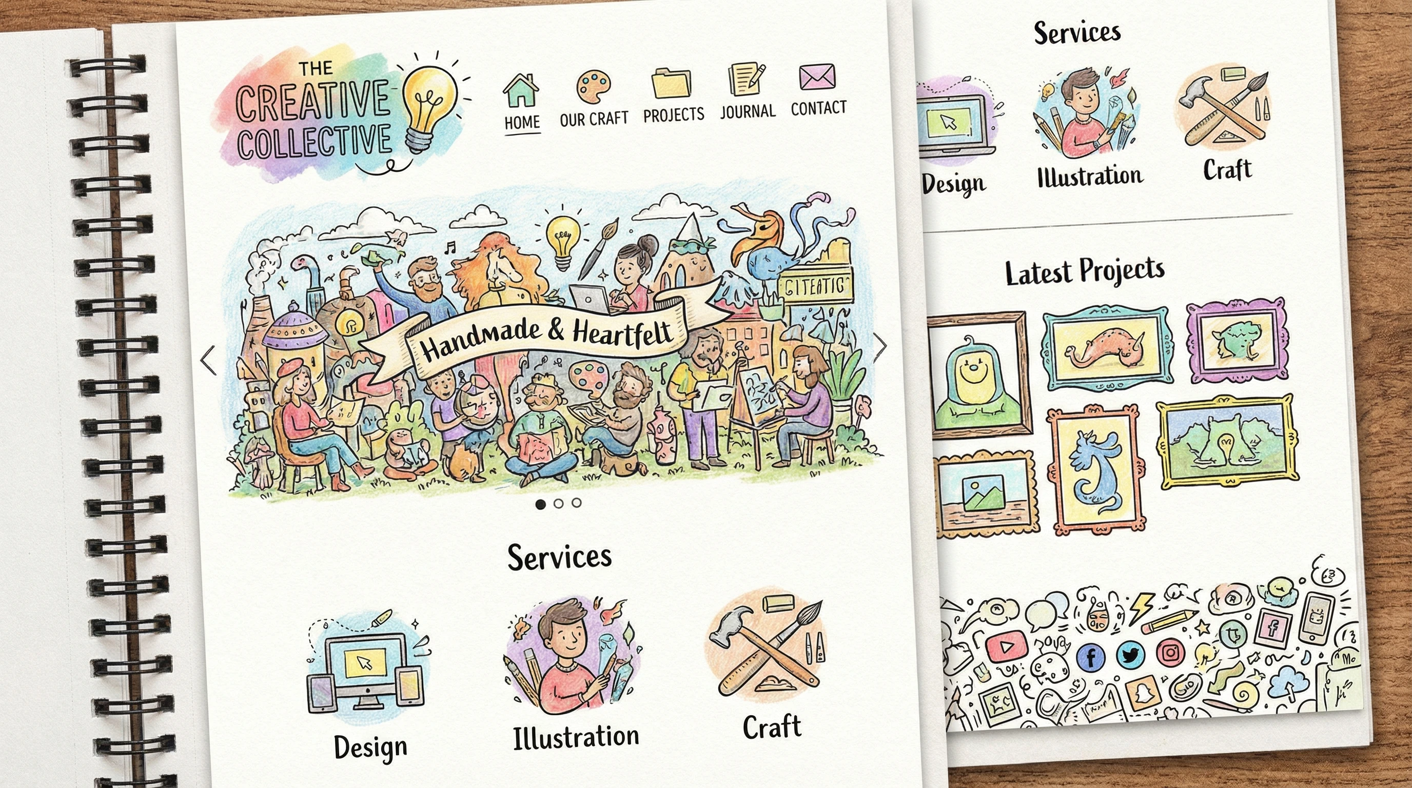
Illustrative & Artistic Design
This style leans into hand drawn elements, custom graphics, or unique layouts. If you want a branded experience that doesn’t look like any other site, this approach is pretty handy. Illustrative touches can create a fun, engaging adventure for visitors.
Pros:
- Shows off creativity and originality.
- Makes a big impression for portfolios.
- Great storytelling potential for personal brands or creative businesses.
Cons:
- Time consuming (and sometimes expensive) to produce.
- Needs real skill to pull off well without looking messy.
Retro & Vintage Design
Retro and vintage design borrows styles from past decades. Think bold fonts, old school icons, or vintage color palettes. This works well for brands that want to spark nostalgia or target a specific era. Popular among clothing shops, restaurants, and event planners who want to lock in a certain mood.
Pros:
- Memorable and atmosphere-heavy.
- Perfect for specialty shops, restaurants, and event sites.
Cons:
- Can look dated if not balanced with modern usability.
- Doesn’t fit every business type.
Modern Corporate Design: Professional and Polished
Modern corporate design brings polished typography, conservative color schemes, and smart visuals together. You’ll see this on most businesses, banks, and software company sites. There’s an emphasis on trust and authority, while still keeping things usable on any device. It’s dependable, futureproof, and easy to adapt if you rebrand later.
Pros:
- Builds trust quickly with visitors.
- Works well for clear communication of information.
- Easy to adapt for mobile and desktop.
Cons:
- Some people find it a little boring or stiff.
- Doesn’t allow for much brand personality if you want to stand out.
How to Choose the Right Web Design Style
Picking your web design style isn’t just about what looks good. Think about your brand’s vibe and your audience. Minimalist and corporate styles are a safe bet for professional companies, while artists, creative agencies, or event planners might get more attention with maximalist or illustrative designs. If you’re updating a site or starting fresh, browsing inspiration galleries like Behance or Dribbble can help spark ideas. If you want extra feedback, ask some colleagues or potential site visitors what first impression each style gives.
Quick Tips for Deciding:
- Look at what your main competitors do. Stand out, but don’t confuse visitors.
- Think about loading times and mobile friendliness.
- Match the style to your message: fun brands can be bolder; serious ones might be better off keeping it slick and minimal.
- Consider accessibility for all users—clean layouts usually work best for everyone.
Web design style isn’t a forever choice. Plenty of sites mix it up as trends change or as the brand grows. Testing different ideas and getting real feedback makes a big difference in finding what works best. You can always blend touches from two or more styles to create something unique for your brand, too.
Which Web Design Style Catches Your Eye?
I’m curious which web design vibe you like most. Got a favorite, or maybe one you’d never use? Feel free to drop your thoughts or share your web design questions below. Finding the right look is something every website owner wrestles with at some point, and your input might help someone else pick their best direction!