
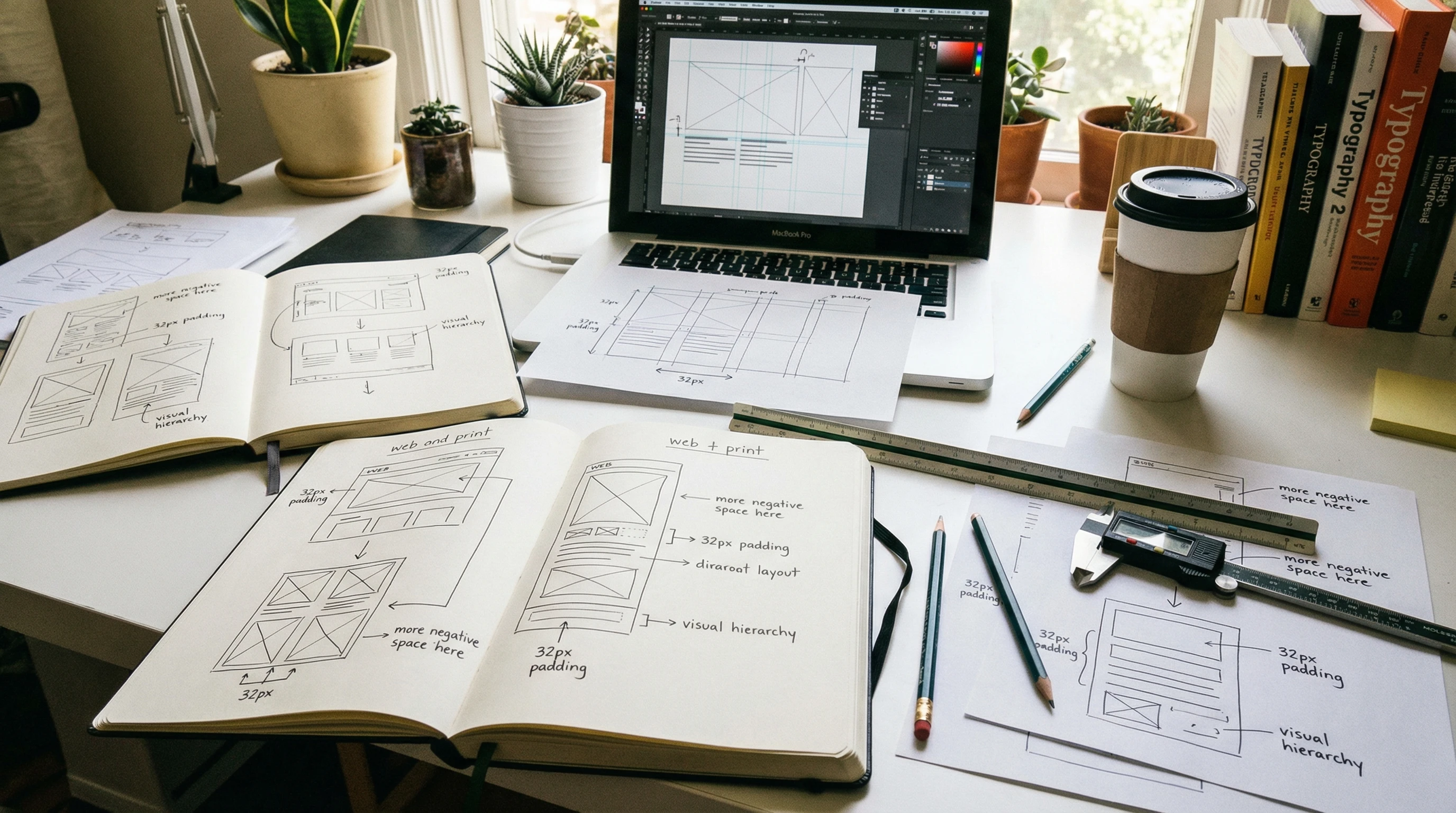
Spacing might seem simple at a glance, but it actually has a big effect on how people feel when they visit a website. The gaps between text, images, and other visual elements play a role in shaping our impressions, influencing what we focus on, and even affecting our mood. Mastering the psychology of spacing in web design is pretty handy if you want to create layouts that feel comfortable and inviting.
Have you ever wondered why some websites just feel easier to use?
Key Takeaways
- Spacing influences how users process information and feel about a website
- Generous spacing makes content less overwhelming and easier to read
- Improper use of space can make a site feel cluttered or bare
- Smart spacing decisions help guide attention and improve usability
- Spacing shapes a brand’s perceived trustworthiness and professionalism
Understanding Spacing: The Psychological Foundation
Space on a website isn’t just empty background; it’s more like breathing room for your eyes. Psychologists refer to the use of empty space as “white space,” even though it doesn’t have to be white. When used thoughtfully, this negative space can reduce cognitive load, or the mental effort needed to process information. It makes everything a bit easier on the brain.
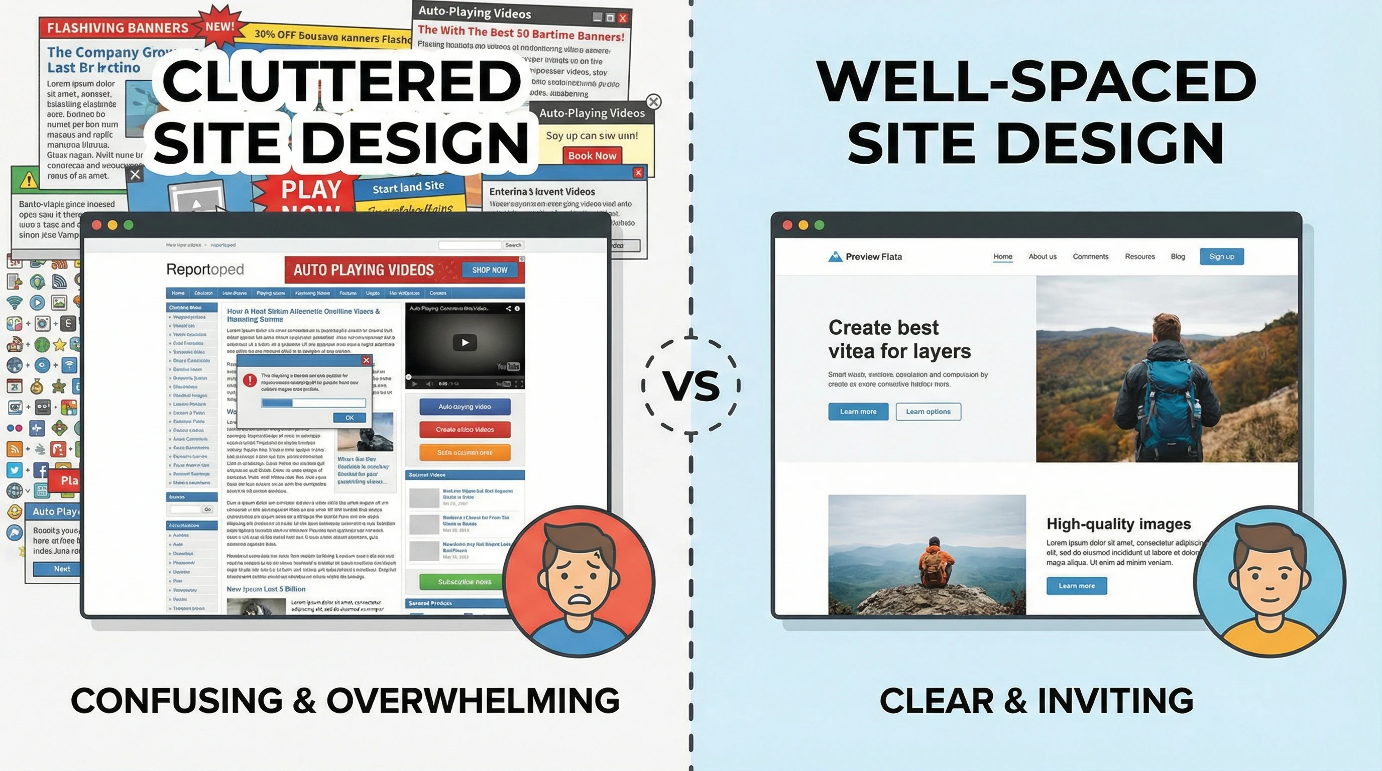
Spacing can also help users feel calm. Busy layouts without clear separation can make people feel anxious or frustrated because nothing stands out. On the flip side, enough space between elements creates a relaxed feel, which can lead to better focus and a longer time spent on a page. This effect is similar across all types of sites, whether you’re checking out an ecommerce platform, a news website, or even a personal blog. When a page feels breathable and open, visitors tend to stick around and check out more content.
The Role of Visual Hierarchy and Focus
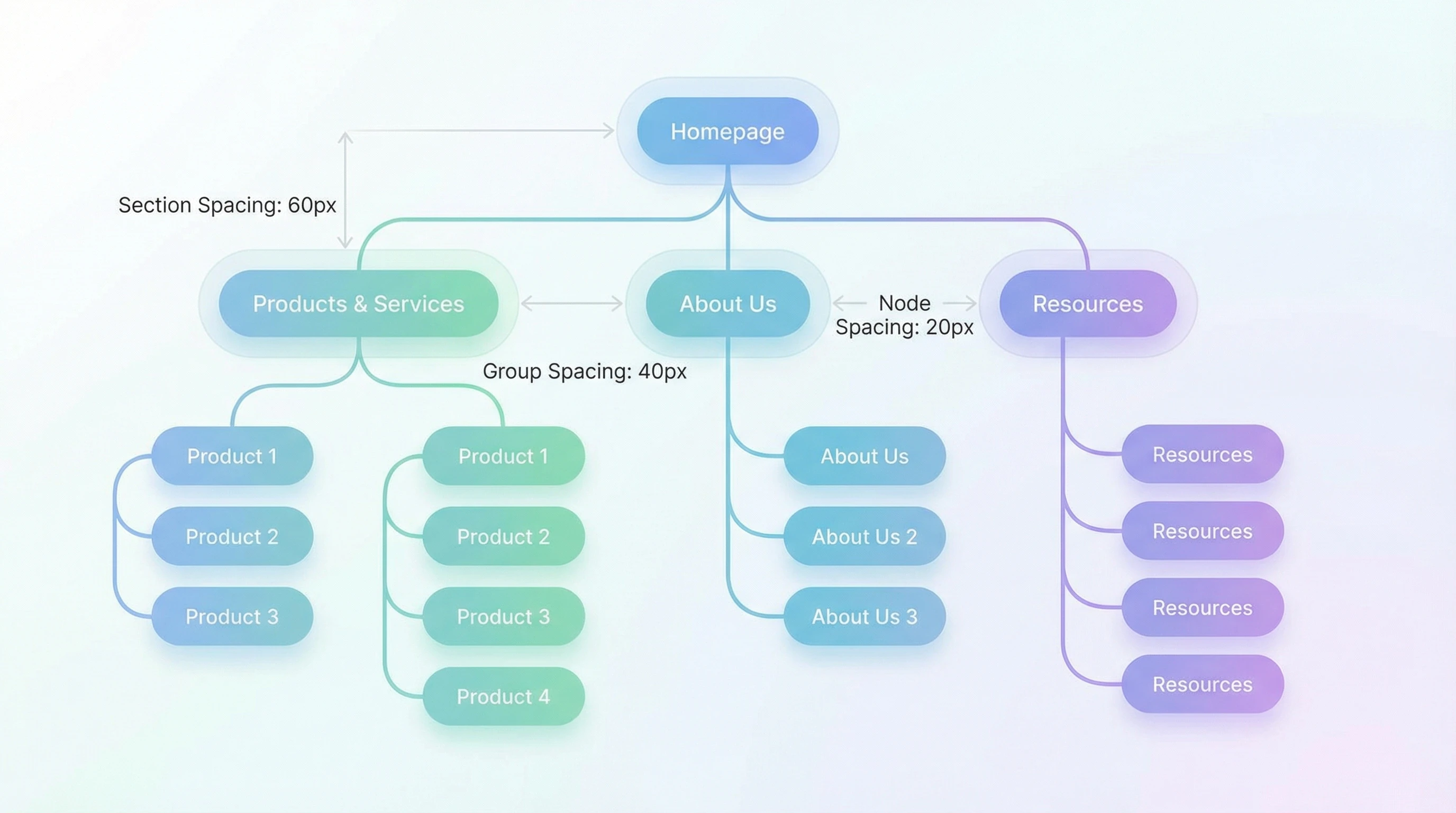
Spacing is a big player when it comes to visual hierarchy. When content is grouped with less space between items, the brain tends to see it as a set. Additional space signals a break and cues the viewer to treat the next section as something new. This effect helps guide users toward the most important content without even using words.
- Pro: Directs user focus and improves content scanning
- Con: Poor spacing can hide important content or cause confusion
A site with well-designed space between headings, paragraphs, and images feels instantly easier to read. You’ve probably spotted sites that cram too much together, and even if the information is great, it feels like hard work to get through. Clear separation invites visitors to take their time. When you use smart spacing, users can quickly glance through your website, picking out key points and deciding what areas are most important to dig into next. Well-planned spacing goes hand in hand with good design.
Emotional Impact and Brand Perception
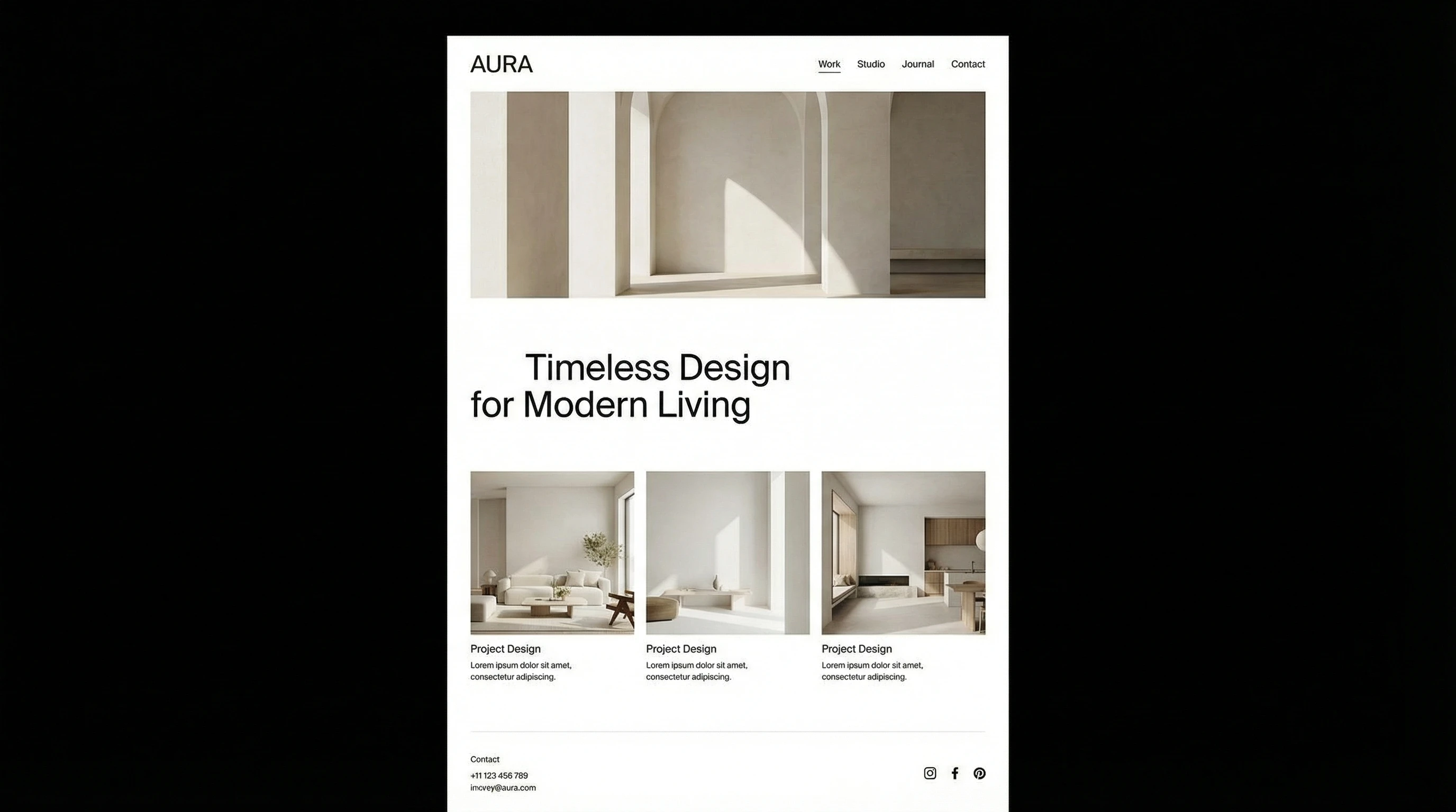
Spacing can seriously switch up how people subconsciously view a brand. Good use of space often connects to ideas of luxury, simplicity, and reliability. For example, websites for high-end products usually use wider spacing and plenty of white space. This design choice quietly tells visitors that the brand values quality and attention to detail.
- Pro: Creates a sense of trust and authority in the brand
- Con: Too much space can make a site feel empty or unfinished
Sites that don’t balance space well might make users worry that the company is disorganized or old-fashioned. What feels clean and minimal to one person can feel sparse to another, so it’s always good to match the style to the audience’s tastes and the brand’s personality. The feel that space brings to a website also strongly impacts a brand’s approachability and friendliness. If your goal is to invite engagement, consider how warm and open your use of space feels to new visitors; a little breathing room can make all the difference.
How Spacing Shapes Usability and Accessibility
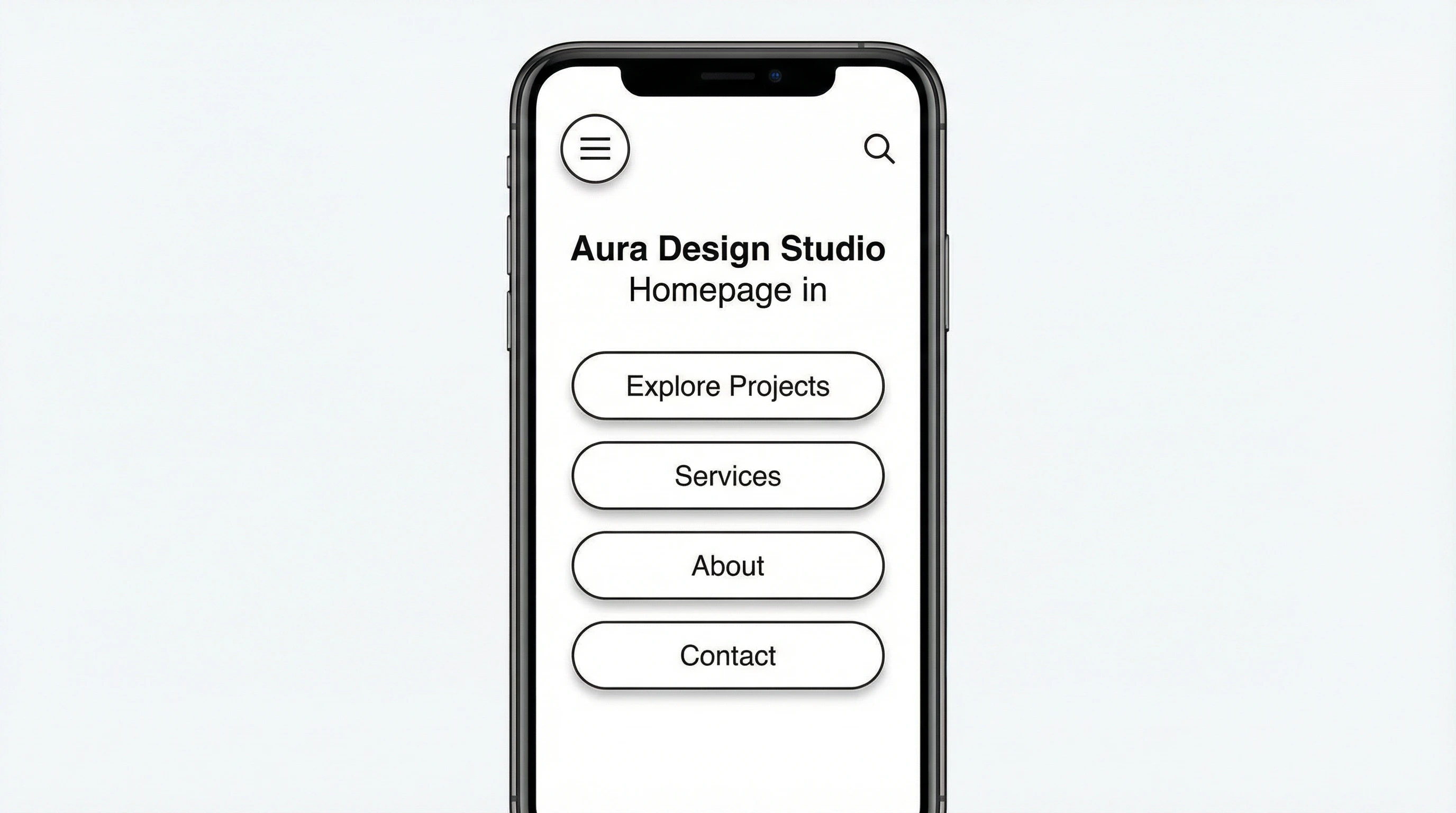
Spacing isn’t just about looks; it’s really important for function, too. Clear space around buttons and links makes them easier to tap, especially for users on mobile devices. Extra space gives a boost to accessibility for people with visual impairments or motor challenges. It’s also helpful for visitors who just like things easy to use.
- Pro: Improves accessibility and usability for all users
- Con: If space isn’t used carefully, pages may become unnecessarily long, which may annoy some users
When content lines or interactive elements are too close together, the odds of accidental clicks go up. A thoughtful approach to margins and padding keeps visitors happier and makes it easier for everyone to get what they need from your site. Even small adjustments in spacing can go a long way for someone using assistive technology or navigating with one hand on a phone. Attention to these details is a simple yet effective way to make your site more welcoming for every user.
Tips for Using Spacing Effectively in Web Design
- Stick to a consistent grid system across your site for harmony
- Make sure there’s enough space between lines of text and sections
- Group related items close together, and separate different topics with more space
- Leave more padding around buttons to help users on touch screens
- Test spacing on mobile and desktop for the best experience everywhere
The best way to figure out if your spacing works is with user feedback. If people find your site pleasant and easy to find their way through, you’re probably on the right track. Don’t be afraid to adjust space until it feels right for your content and your audience. Try A/B testing different layouts, or watching how users interact with your pages—real-world use can often highlight issues you didn’t spot during the design phase.
Bottom Line
Spacing is one of the most powerful tools in a web designer’s toolkit. While it may seem like a small detail, getting it right can make the difference between a site that feels welcoming and one that pushes people away. Every website benefits when designers look at not just what’s there, but also the space in between. So next time you want your site to feel eye-catching, trustworthy, and genuinely usable, pay attention to the spacing. Your users will notice—even if they can’t quite put their finger on why!
Question For Readers
What’s your biggest challenge with spacing in web design?
Feel free to share your experience or tips below. I always enjoy seeing the creative ways people make their layouts come alive.