
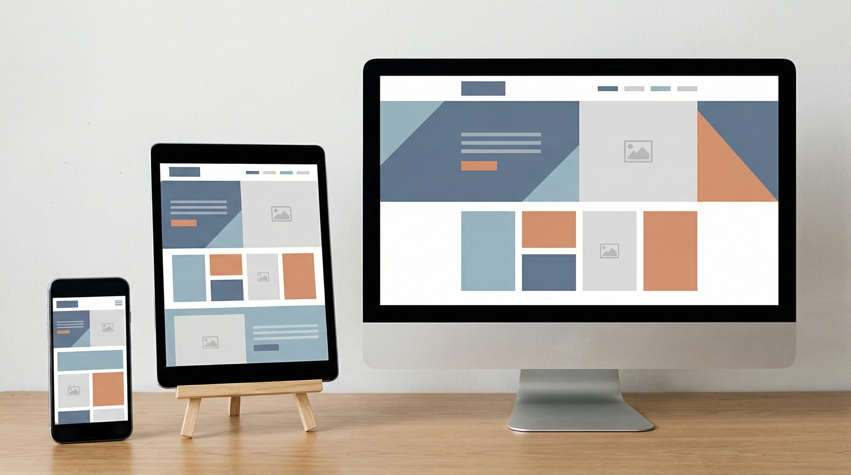
CSS is what makes websites look good and work well on any device. Without CSS, the idea of responsive web design just doesn’t happen. CSS controls everything from layout to buttons, and it’s the tool that helps web pages adapt to phones, tablets, laptops, and giant monitors seamlessly.
Ever loaded a website on your phone that looked totally broken? CSS is the reason that doesn’t usually happen anymore.
⭐ Main Points
- CSS is the backbone of responsive design, letting websites look good everywhere
- Flexible layouts with media queries that react to screen size
- Techniques using flexbox and grid for adjustable site structure
- Managing images and typography for legibility on any device
- Mobilefirst CSS and its big benefits
- Challenges and tips for realworld responsive styling
CSS Building Blocks: Why CSS Matters in Responsive Web Design

CSS (Cascading Style Sheets) is what handles the entire visual layer of a website. HTML might have the content, but CSS decides how everything is displayed. In a world where people use everything from smartphones to 4K TVs to browse the web, CSS steps in to make sure content adapts, scales, and stays userfriendly. Responsive design depends on CSS to swap out layouts and change styles based on device capabilities.
Over the years, CSS has added new features that make it possible to write rules once and have sites work everywhere. Features like media queries, new layout tools, and unit types (like rem, vw, and %) really make a difference for designers who care about all their users. As these features have spread fast, the options for smoother, more consistent user experiences have grown.
If you’re new to responsive web design, CSS is your best friend. With just a bit of practice, you can use it to adjust every element so it looks sharp at every screen width or orientation. Whether you’re building a blog or a company website, CSS gives you the flexibility you need. Plus, it’s fun to check out the creative ways people use CSS to step up their designs without tons of extra code.
Media Queries: The Secret Sauce for Flexible Layouts
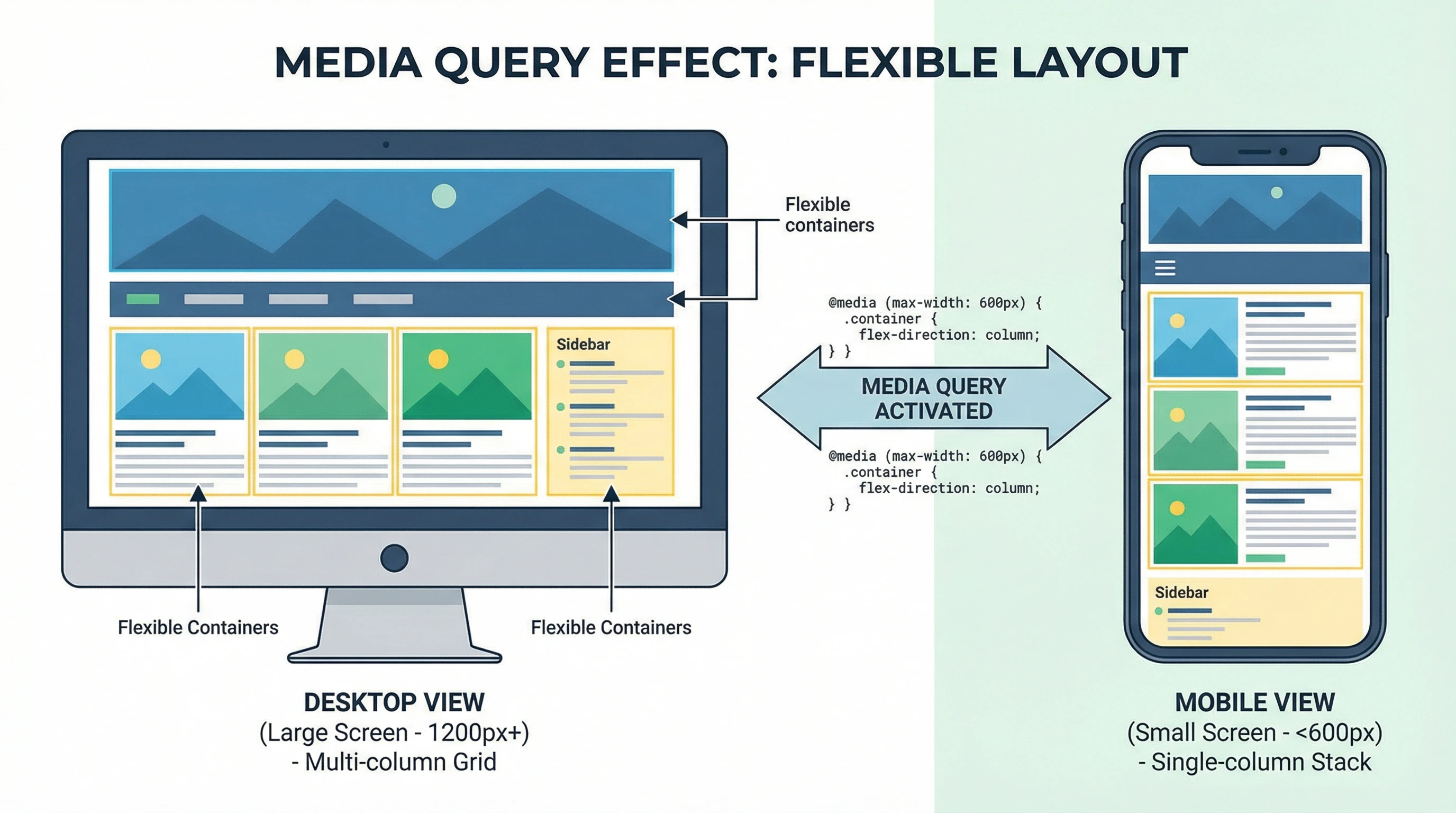
Media queries let you create different CSS rules depending on the screen size, resolution, device settings, or even dark mode. Most responsive websites use media queries to adjust things like navigation, columns, and font sizes. For example, you might stack a menu vertically on mobile but spread it out horizontally on desktop. It’s all done with a couple of lines of code.
Using media queries, it’s easy to tweak a site for tablets, big phones, or wide monitors. It’s super useful for things like switching from single to multicolumn layouts or making images shrink and stretch with the screen. This way, users always get an experience tailored to their device.
It’s worth checking in on your breakpoints now and then to make sure they cover the devices your audience actually uses. Sometimes, a tiny change in a media query can make a massive difference to usability.
Modern Layout Tools: Flexbox and Grid for Pro-Level Responsiveness
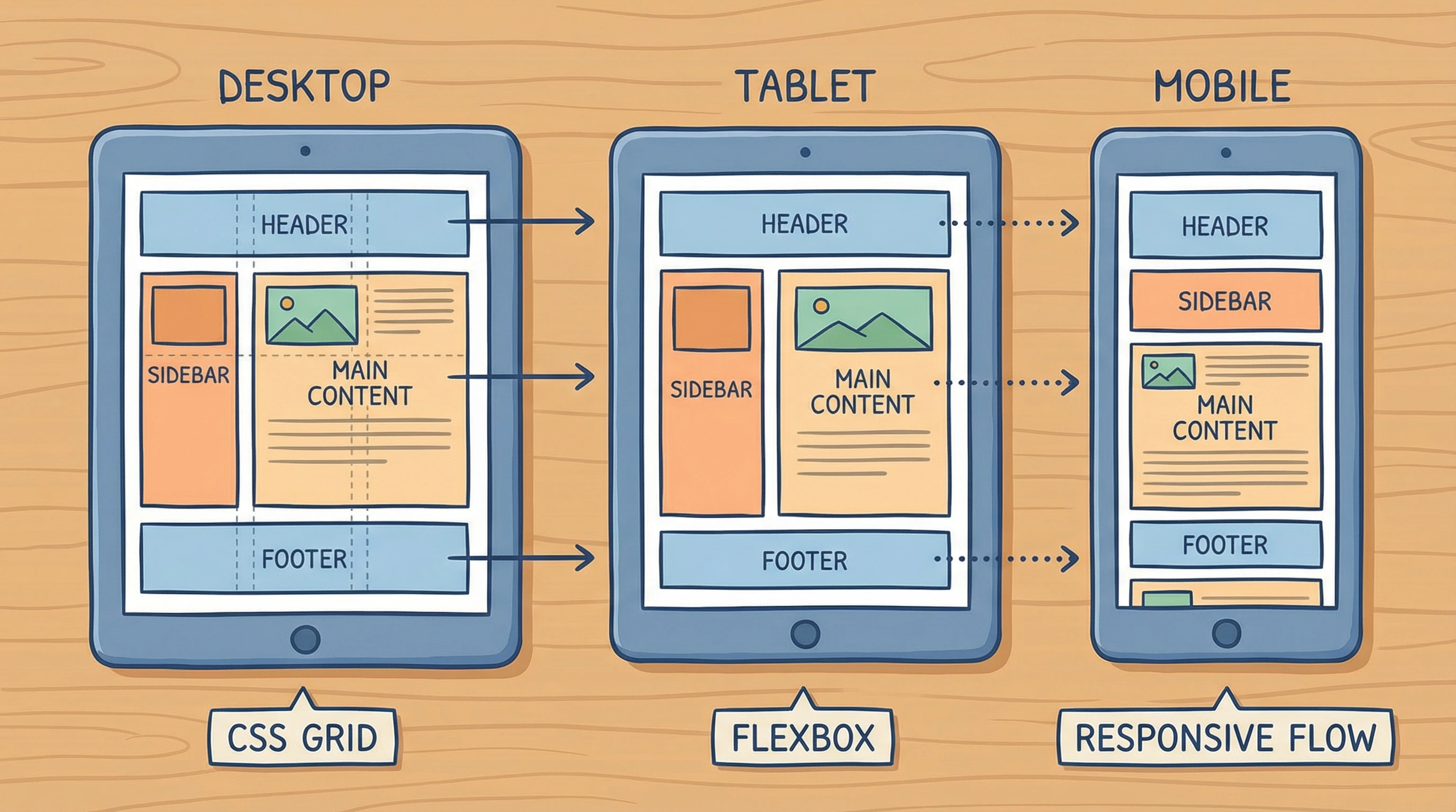
Flexbox and grid have changed the game for responsive layout. With flexbox, you can arrange items in a row or column and have them automatically wrap or stretch to fit the space. CSS grid is even more powerful for page layouts. Think magazinestyle designs that switch up based on screen width.
Both tools work really well with media queries. I like using grid for the main page layout and flexbox for navigation or image galleries that need to adapt to all sorts of shapes and screen sizes.
While flexbox is great for simpler content areas or navbar adjustments, grid lets you lay out entire pages with headers, sidebars, and footers that realign smoothly on everything from a phone to a huge desktop monitor. Try mixing them together for nextlevel cool results and a smoother workflow.
Handling Images and Typography for Every Screen
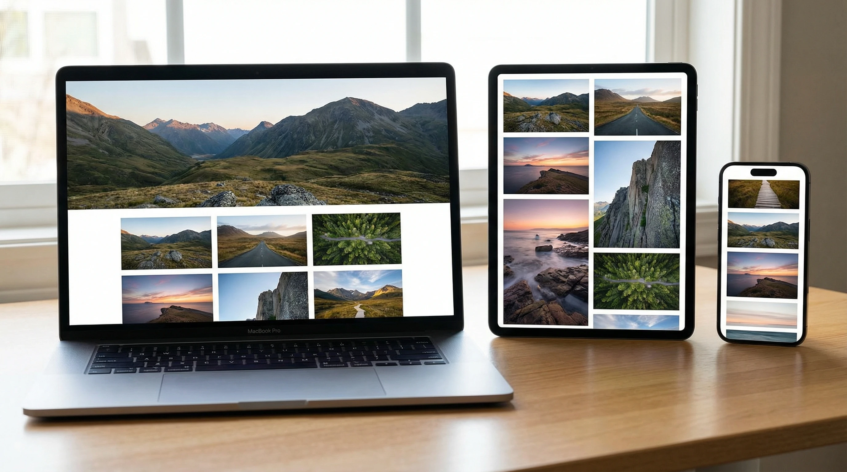
Images and text that don’t scale up or down can ruin the mobile experience. CSS lets you use relative units like em, rem, and percentages to keep text readable everywhere. Tools like objectfit and maxwidth: 100% help images fit their containers without getting blurry or cropped.
Responsive typography and smart image sizing are super important for accessibility, load speed, and keeping your website looking sharp on all devices. It’s also smart to use modern file formats like WebP for images to help pages load faster for everyone.
Don’t forget SVGs! Since they’re vector, SVG graphics scale beautifully and stay crisp at any resolution. Combining these with your CSS skills can really give a boost to your site’s visual impact.
Mobile-First CSS and Helpful Tips for Real-World Sites
Mobilefirst CSS is all about writing basic styles for phones first, then layering on extra rules for bigger screens. I’ve found this approach is easier to manage and loads faster for most users, since most web traffic these days starts on mobile. Keeping your CSS modular and organized makes things way less messy, too.
Testing on actual devices is really important to catch weird spacing, tiny buttons, or scroll problems. Browser dev tools with device emulators are pretty handy, but nothing beats checking your own site on different screens whenever you change something. Try handing your site to a friend or relative and see how easily they can use it; sometimes you’ll spot problems you never thought of.
CSS plays a huge part in boosting site performance, accessibility, and design consistency, so it’s worth tracking down the latest tricks and updates in CSS. Keep an eye out for new modules and keep your code as clean as possible. Fewer lines not only load faster but are easier to update later.
🚀 Final Thoughts
Mastering CSS for responsive design is a skill every modern web creator benefits from. It’s not just about fancy looks. It’s about making sure anyone, anywhere can use and enjoy your website, no matter what device they grab first. Try out different CSS techniques, stick with what works, and always be open to learning something new.
💡 What Do You Think?
What’s your favorite CSS technique for responsive sites?
I’d love to hear about the tricks or tips that have saved your projects. Share your experience below!