If you’ve ever landed on a website and immediately thought, “Wow, this looks amazing,” you’ve experienced the power of good visual design. A visually appealing website draws people in, feels easy to use, and sticks in your memory long after you’ve moved on. Getting those eye-catching looks is about more than just picking cool colors and trendy fonts. Smart choices in layout, images, type, and overall structure shape how everything comes together and help create that lasting, next-level cool impression.
Ever get stuck trying to figure out what makes a site really pop?
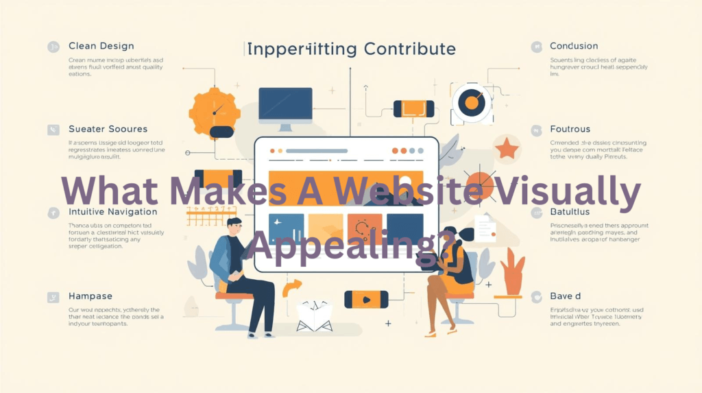
⭐ Quick Highlights: What Makes Websites Visually Appealing
- Clear layout that makes things easy to find
- Balanced use of color for mood and branding
- Font choices that are readable and fit the vibe
- High quality images for visual interest
- Consistent visual style across all pages
- White space so nothing feels crowded
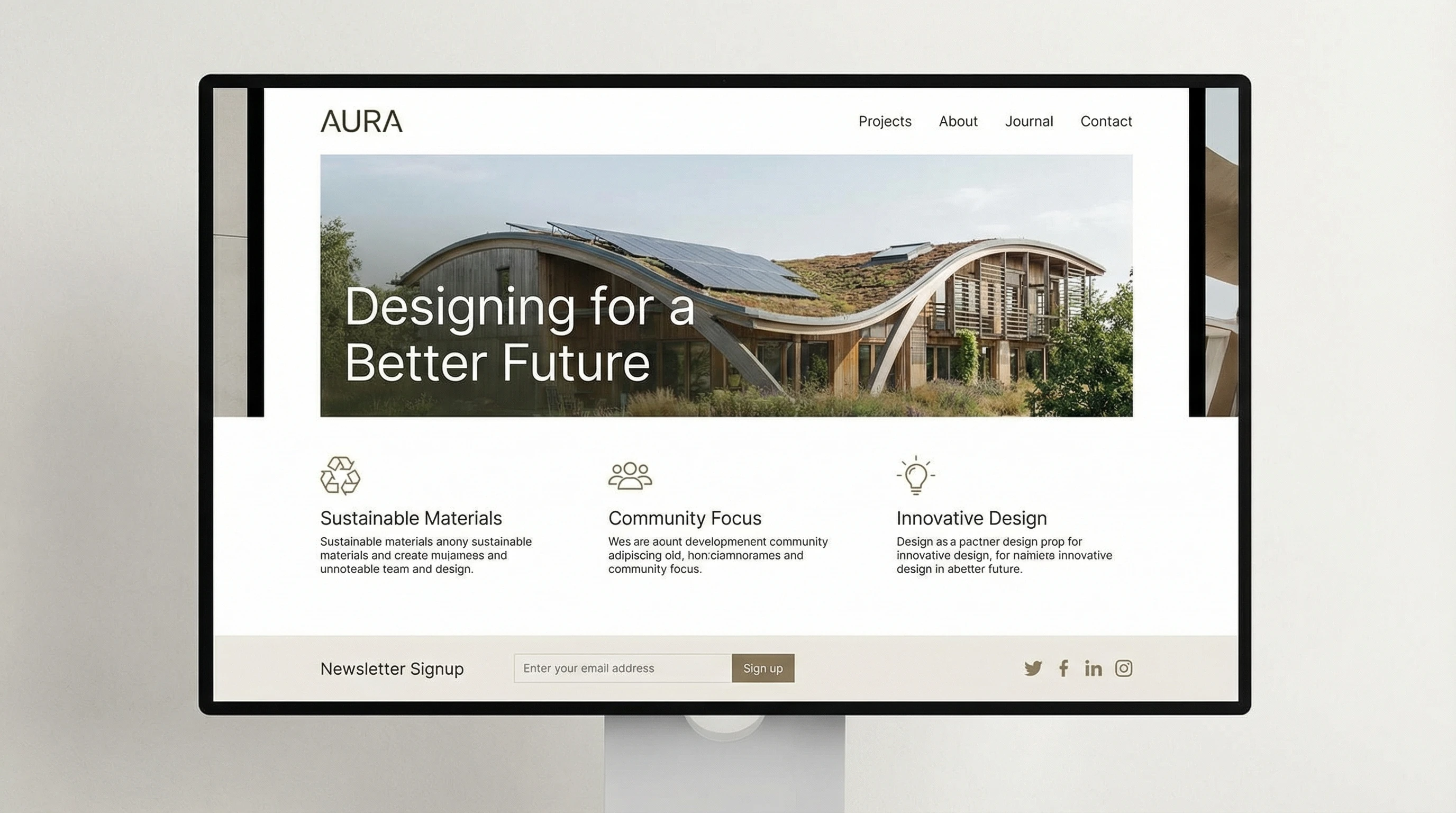
Layout and Structure: The Foundation of Style
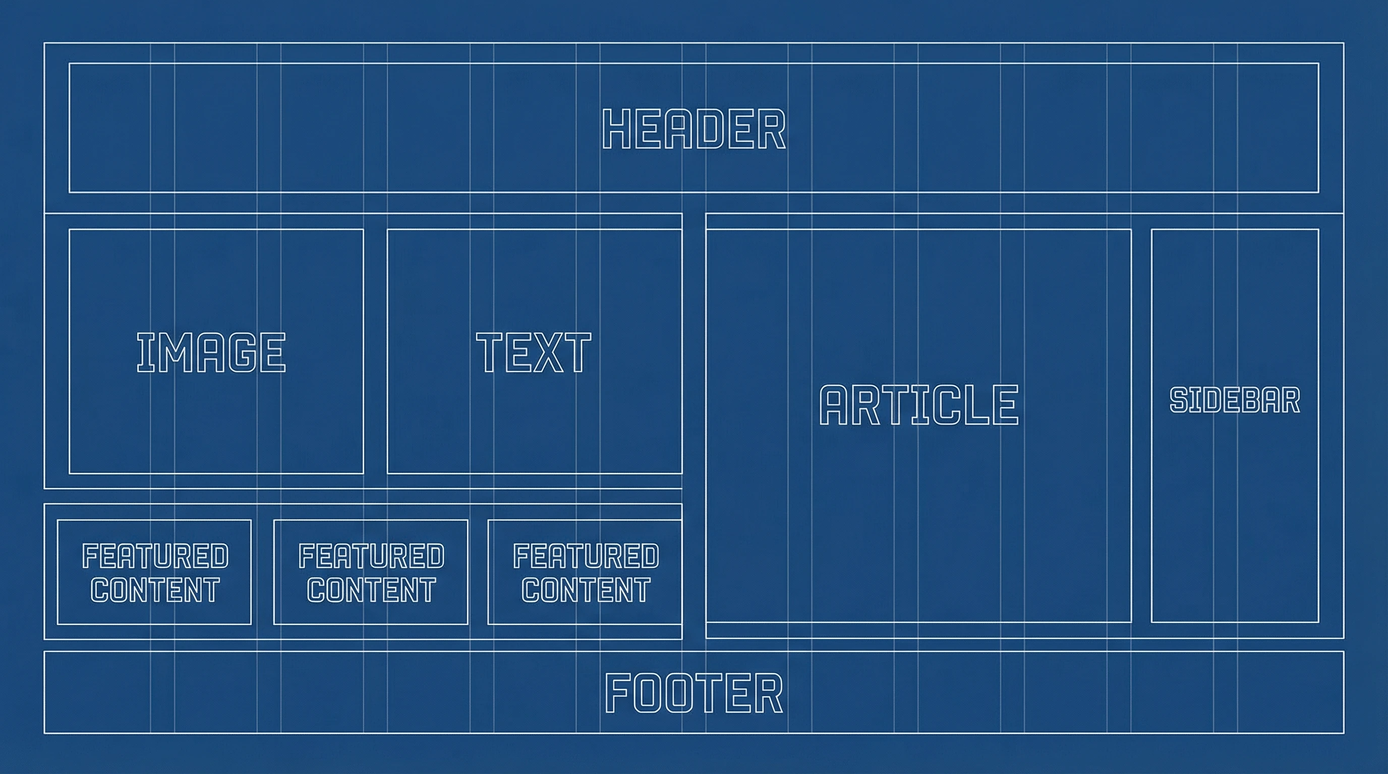
When I’m building a website, I always start with the layout. A strong structure makes everything feel organized, guiding visitors smoothly from one section to the next. Grid systems and visual hierarchies help direct the eye, and a logical flow means users don’t get lost.
Adding white space (the empty areas around text and images) helps prevent visual overload. It gives content room to breathe and makes important parts stand out more. This attention to organization and space can really make a website feel polished, helping users get where they need to go without feeling overwhelmed or distracted.
- Pros:
- Pages are easy to scan and find your way through
- Makes information feel less overwhelming and more approachable
- Cons:
- Getting spacing right can take trial and error
- Too much white space might leave the page feeling empty
Color Choices: Setting the Right Tone
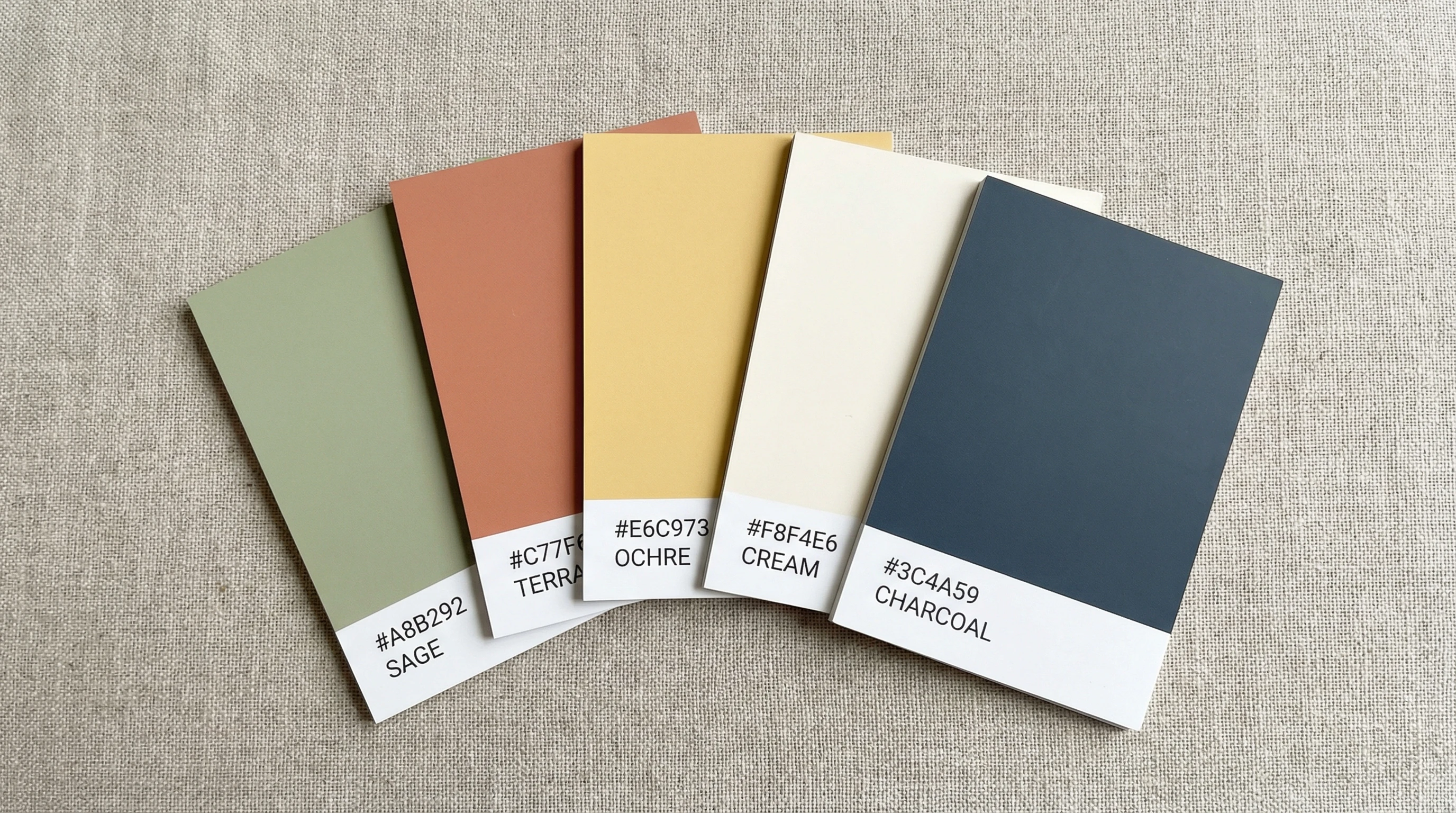
Color is one of those things I notice right away on a website. Different colors create certain moods and help people recognize the brand. For example, blues can feel calm and trustworthy, while bright oranges or reds stand out and feel energetic.
Sticking to a small color palette helps things look consistent. Too many colors can be distracting, but just a few well-chosen shades create harmony and make navigation easier. It’s also a great way to draw attention to important buttons or calls to action, making sure users know where to click next.
- Pros:
- Sets a mood and strengthens branding
- Makes buttons and links easy to spot
- Cons:
- Poor color choices can make text hard to read
- Colors look different on different screens
Typography: Readability with Personality
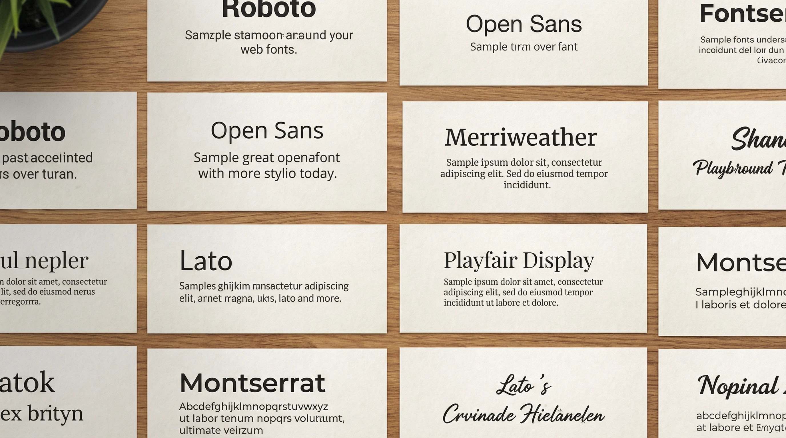
The right font can make a website look modern and friendly, while another can feel old-school or even hard to read. I always pay attention to both the style and the size of the text. Big, bold headings grab attention, while clean body text helps people actually read what’s there.
Mixing font styles for headings and body text can add variety, but too many styles can get messy. Keeping things simple and using just enough character ensures the text always looks sharp and readable on all devices, from desktop computers to your phone. It’s also important to make sure there is enough contrast between text and background so visitors don’t have to strain their eyes.
- Pros:
- Improves readability and helps users get involved
- Adds personality to a site without distracting from the message
- Cons:
- Poor contrast can cause eye strain
- Fancy fonts might not be supported on every browser
Images and Graphics: Bringing the Site to Life
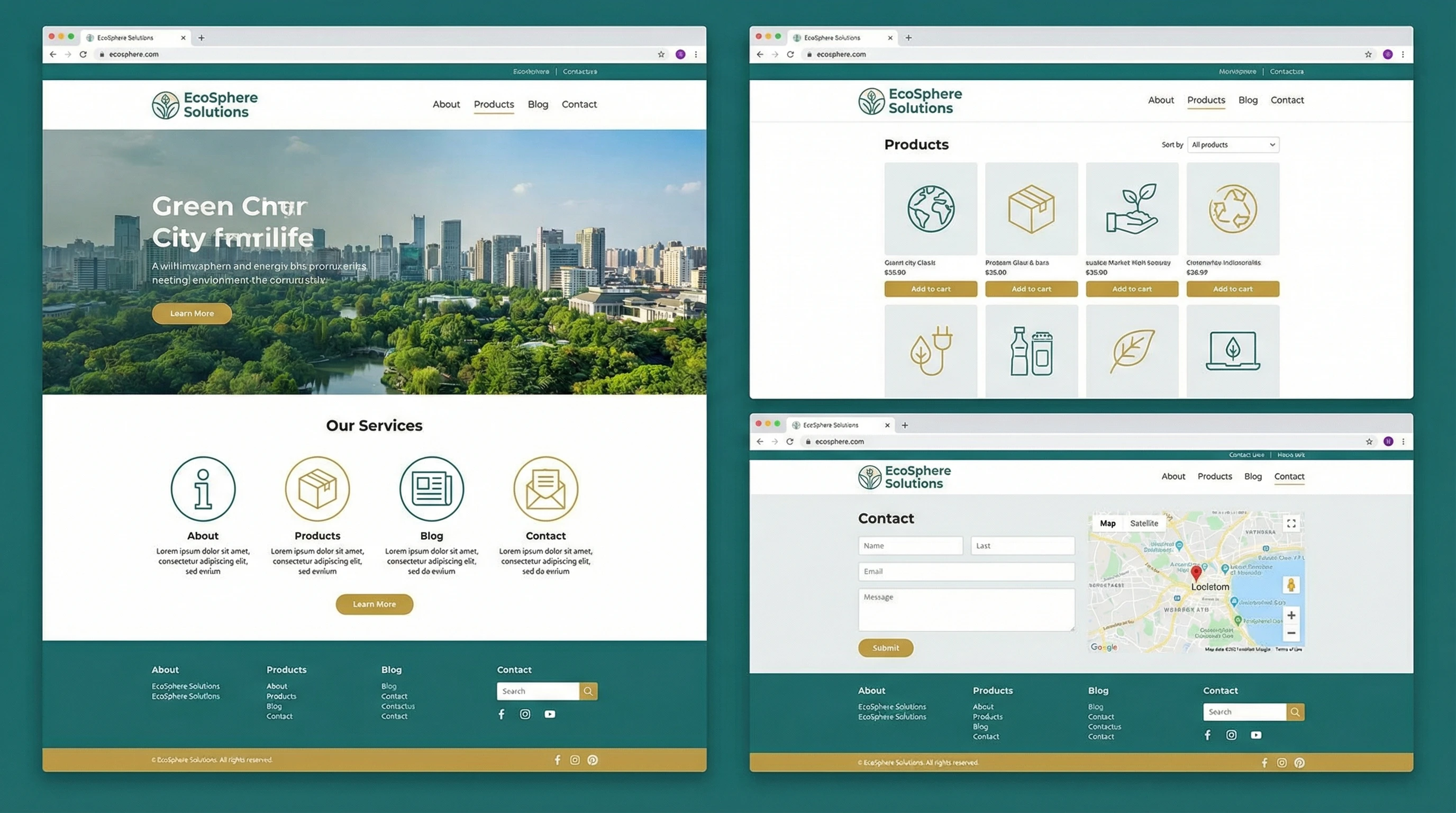
I like to use high quality images that actually add something useful, not just random stock photos. Custom graphics, icons, or graphics tailored to the brand really give a boost to visual appeal. Animation and subtle effects add interest, but they shouldn’t get in the way of finding information.
Some of the most next-level cool sites feature original illustrations or photography, making the experience feel special and on-brand. However, it’s just as important to keep an eye on image file sizes so the site stays fast and user friendly.
- Pros:
- Makes content more memorable
- Shows off products or services in a real way
- Cons:
- Large images can slow down websites
- Poorly chosen graphics look unprofessional
Consistency and Brand Vibe
Consistency might sound boring, but it’s super important for visual appeal. By sticking to one style for things like buttons, backgrounds, and navigation menus, I help visitors feel like every part of the site belongs together. Repeating visual cues makes things easier to use and reinforces the vibe I want people to remember. It also supports the branding, which is essential for people to recognize and keep coming back to your site over time.
- Pros:
- Creates trust and helps people remember the site
- Keeps navigation simple and predictable
- Cons:
- Takes work to set up and maintain
- Can feel repetitive if not balanced with fresh content
Final Thoughts: Why Visual Appeal Matters for Websites
Visual appeal isn’t just about looks. It affects how people feel, how they use the site, and whether they come back in the future. A website that looks clean and puts information in the right places helps visitors feel comfortable and confident while browsing. It’s one of the best ways to make a site stand out in a crowded online world and keep people coming back for more.
👀 Your Turn
What grabs your attention when you visit a website for the first time?
Share your favorite website design tips or stories below. I’m always interested in what catches your eye and what helps you stick around online.