

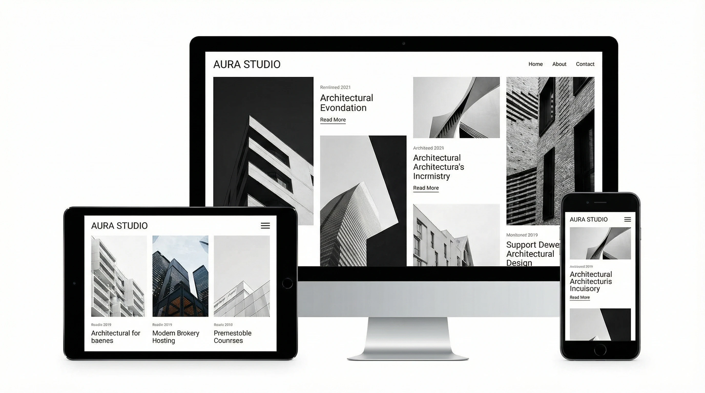
Responsive design means your website automatically adapts to any screen size, whether someone’s using a laptop, tablet, or phone. These days, I don’t see many businesses getting by without it, especially with search engines favoring mobile friendly sites big time. I’ve seen how a well-built, responsive site can help with everything from SEO rankings to visitor engagement.
Ever checked your site on a phone and realized it’s a total mess?
⭐ Key Points
- Responsive design is super important for SEO in today’s mobilefirst world
- Google prefers mobile friendly websites, boosting rankings for sites that work on all devices
- User experience, bounce rate, and engagement all improve with a responsive layout
- Responsive design helps speed up your site and keep visitors around longer
- Managing a single responsive site is easier than juggling separate mobile and desktop versions
- Future updates and SEO tweaks are simpler with a responsive setup
The MobileFirst Era and Google’s Priorities

It feels like almost everyone browses on their phone; sometimes I even check websites on my tablet while I’m making coffee. Google uses mobile first indexing now, which just means the search engine looks at the mobile version of your site to figure out how it should rank in search results. If your website isn’t easy to use on a phone, your ranking can drop. That meant fewer visitors and missed opportunities.
A responsive site shows Google you care about your visitors on every device. That puts you in good standing for better rankings, as Google keeps rolling out updates that prioritize user experience.
While desktop computers still matter, mobile devices are at the front of today’s web traffic. That trend keeps growing fast, so having a responsive website is more important than ever. Google even provides tools like the Mobile-Friendly Test so you can quickly check if your site meets their standards. Simple tweaks, like bigger buttons or lighter images, go a long way to giving everyone a smoother experience—something Google definitely rewards.
User Experience: Why Visitors Stick Around
A website that’s easy to use, without pinching, zooming, or strange scrolling, is way more likely to keep people happy. I’ve left countless sites just because I couldn’t find my way through them on my phone. Reducing bounce rate (when people leave immediately) is super important for SEO, and a responsive design makes that possible.
When visitors can browse without hassle, they’ll check out more pages or even convert into customers. Google tracks these good signals, which can help you climb higher in search results. Plus, when your content displays clearly on any screen, people are more likely to interact, share, and come back for more. That loyalty is a huge asset in today’s competitive online world.
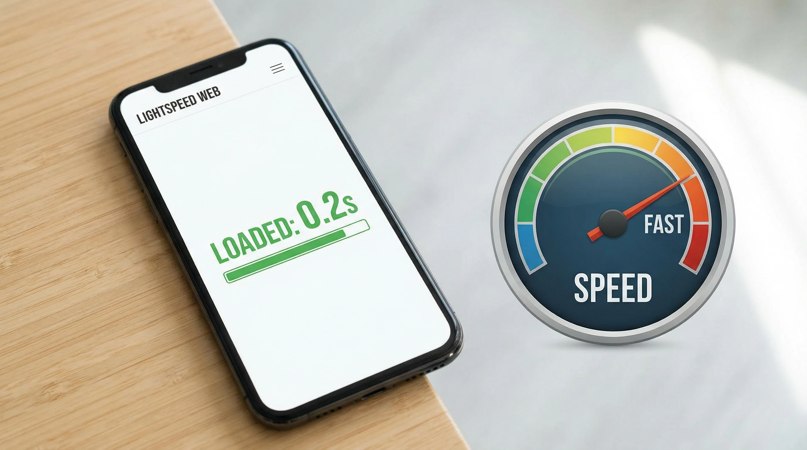
Better Performance and Faster Site Speed
A responsive site isn’t just pretty; it tends to load way faster, especially on mobile. Fast load times are a ranking factor for search engines and can make or break the user experience. Optimized images, streamlined code, and layouts that adapt to devices all keep your website speedy.
If your site is slow or clunky, visitors bounce, sometimes before the page even loads. Search engines notice that and it can hurt where you show up in the results. Speed also plays into accessibility and helps ensure everyone from casual browsers to power users can get the info they need fast. To give your site a boost, keep testing speed with tools like Google PageSpeed Insights and act on the suggestions—simple changes can make a noticeable impact on both user satisfaction and SEO.
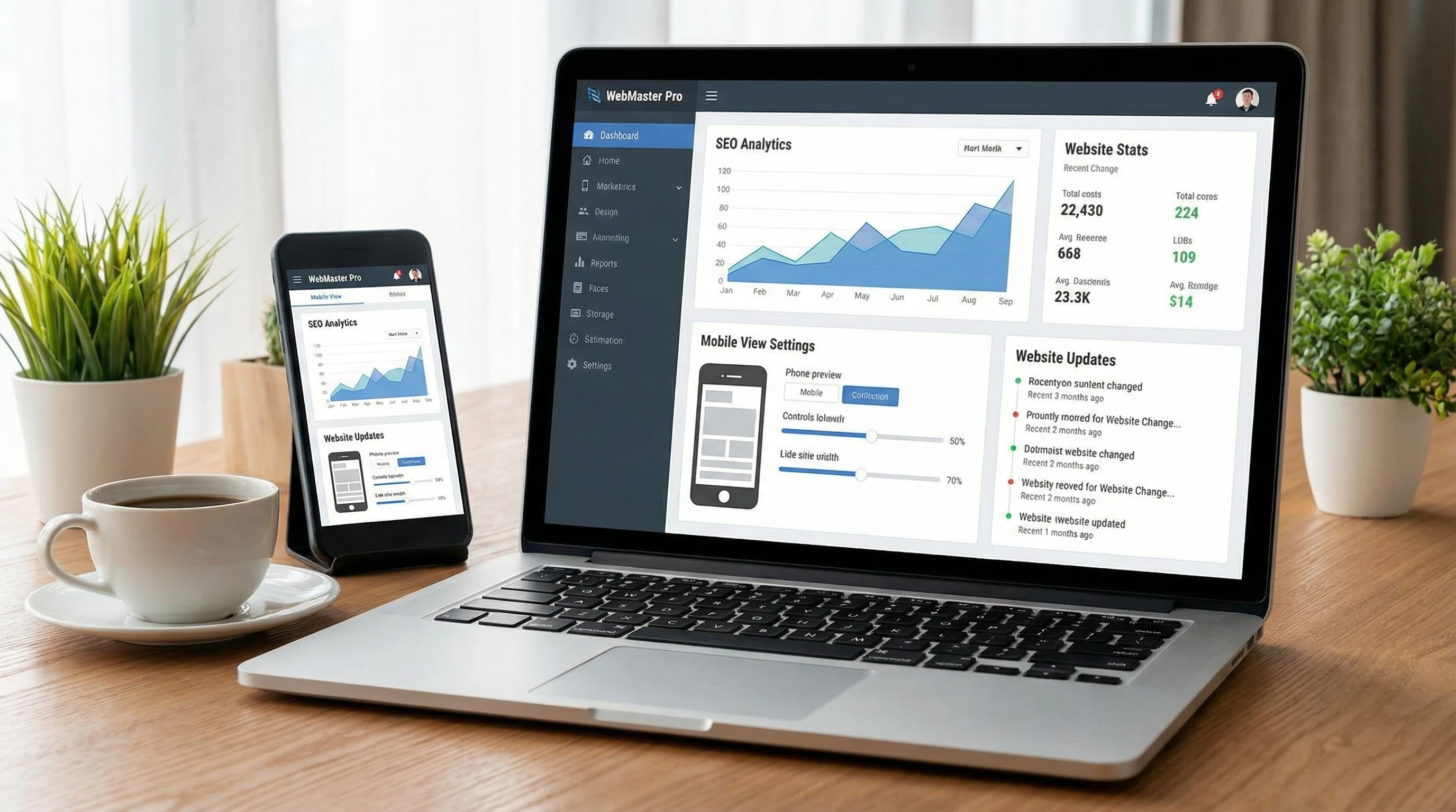
Managing Your SEO: Simpler with Responsive Design

Trying to keep up with two different versions, a desktop site and a mobile site, gets chaotic fast. I’ve seen how tiring it can be to update both, especially when making SEO tweaks or pushing out new content. Responsive design means you only need one set of changes, which saves time and lowers the risk of mistakes.
When you update just one site, it’s much easier to keep everything in sync and avoid duplicate content problems. Google also loves clear, consistent websites. With responsive design, you’re hitting their guidelines right out of the gate.
As your business grows, so will your website. Having a single, responsive site makes it easy to add features, run tests, and stay current with trends. You also reduce the need for lots of third-party plugins or hacks to create mobile versions, cutting back on headaches and making your workflow smoother overall.
The Future: Staying Competitive and Ready for What’s Next
Responsive design isn’t just about catching up; it’s about staying ahead. As devices keep evolving, from smartphones to smartwatches, having a flexible website means you’re ready for whatever search engines and tech trends bring your way. That kind of preparation gives your site a real shot at lasting, steady SEO success.
Technology moves quick, and trends like voice search, larger phone screens, or wearable tech can catch businesses off guard. Responsive websites help you stay adaptable, so your online presence remains professional no matter what the digital world looks like tomorrow. If you want to set your site up for long-term success, prioritizing mobilefriendly and responsive design is one of the smartest moves you can make right now.
💡 Engaging Closing Line
Have you checked how your site looks on different devices lately? Share what strategies or changes worked best for you and help others in the community build mobile friendly websites that drive results!